

 (617) 375-0076
Exhibitions
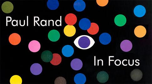
Paul Rand and the Rise of American Modernism
June 2022
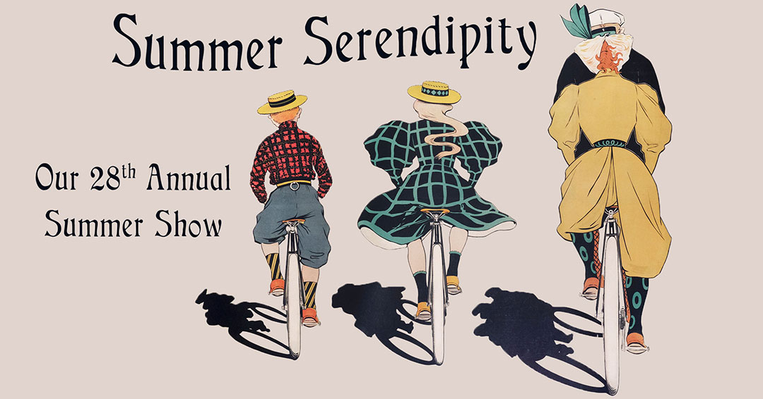
Summer Serendipity
July 2021
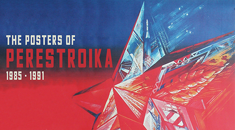
Spotlight On Perestroika Posters
March 25 2021 -
Perestroika Posters 1896 - 1991

Picturing the Past: The Year in Posters - 1920
May 2020
We took a close look at posters from our collection from one year - 1920. How do they reflect the world in which they were created, following the epic upheavals of World War I, the Spanish Flu Epidemic, and the Bolshevik Revolution? One hundred years later, will some of these themes be repeated in 2020 in the wake of the COVID-19 pandemic?

Holiday Stars: Posters to Celebrate the Season
December 6, 2019 - January 6, 2020
'Tis the season for our 26th Annual Holiday Poster Show! Great posters never go out of fashion, and our latest exhibition features some superb new acquisitions as well as other favorites to celebrate the season. The exhibition will be held from December 6th to January 6th at our gallery at 460C Harrison Avenue in SoWa, Boston’s art and design district.
The joys of the season include some of our favorite subjects – travel, food and beverage, fashion, film, opera, rock ‘n roll and winter sport.

Premier Posters: Art Deco & Art Nouveau Rarities
September 17 - October 31, 2019
We are pleased to announce a star-studded exhibition, Premier Posters: Art Nouveau & Art Deco Rarities. Drawing on recent acquisitions to our collection, the exhibition features hard-to-find works that helped shape the two major decorative movements of the poster’s first 50 years – Art Nouveau and Art Deco classics from the 1890s & 1900s. The show will be on exhibition in our SoWA gallery in Boston through the end of October.

Our 25th Anniversary Show Winning Posters!
May 7th - June 21st, 2019
Our latest exhibition “Winning Posters!” celebrates the 25th anniversary of International Poster Gallery (IPG), one of the world’s leading vintage poster galleries. The exhibition includes a selection of fifty posters that represent the gallery’s diverse specialties. The exhibition will be held from May 10 to June 21st at our gallery at 460C Harrison Avenue in SoWa, Boston’s art and design district.
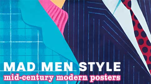
Mad Men Style: Mid-Century Modern Posters
March 1st - April 22nd, 2019
We are proud to present Mad Men Style: Mid-Century Modern Posters, a retrospective and sale of over 50 original posters from 1950 to 1969. The exhibition takes place in our SoWa gallery through April 21st and features a broad range of posters from noted artists including David Klein, Stan Galli, Paul Rand, Herbert Leupin, Josef Muller-Brockmann and many more.

The Machine Age Style: Art Deco Poster Masterpieces 1925-1939
October 5th - October 31st, 2018
We are proud to announce The Machine Age Style: Art Deco Poster Masterpieces, a retrospective exhibition and sale of over 40 works from 1925 to 1939. The exhibition takes place in our gallery in SoWA and features many seminal works including a fine group of A.M. Cassandre’s posters.
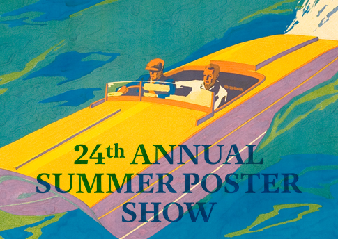
Speed Into Summer
August 14th - Labor Day, 2017
Here's a sample of our 24th Annual Summer Poster Exhibition - from travel and transportation to fashion, design, music and the arts.

Summer Style
August 1st - Labor Day, 2017
We are celebrating the spirit of the season with our 24th Annual Summer Poster Show. The joys of beach, travel, music, sport, fine food and spirits from the 1890s to the present are featured in more than 40 vintage posters on exhibit in our gallery.
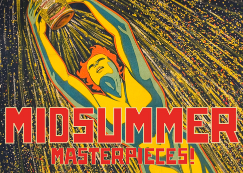
Midsummer Masterpieces
July 3 - July 31, 2017
Stunning new arrivals, the subject of our exhibition last month, is the focus of our latest blockbuster show, Midsummer Masterpieces. The posters form the core of our new exhibition through July 31st.
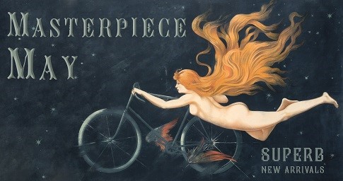
Masterpiece May
Extended - late June 2017
April showers have brought May flowers at International Poster Gallery! We are proud to announce our exhibition, Masterpiece May - Superb New Arrivals, including masterpieces of Art Nouveau and Art Deco, every type of Modernism in the 20th Century, and a wide variety of subjects at all price ranges. The exhibition is being extended through late June at our new SoWa Gallery in Boston's South End.

Wintersport II
January 3 - January 31, 2017
We are proud to announce our follow-up exhibition, "Wintersport II - More Prized Vintage Posters from the Golden Age of Skiing 1900-1960", which features rarely seen posters from the earliest days of the sport to the advent of the metal ski. The show will be on exhibit at our Newbury Street gallery in Boston through the end of January.
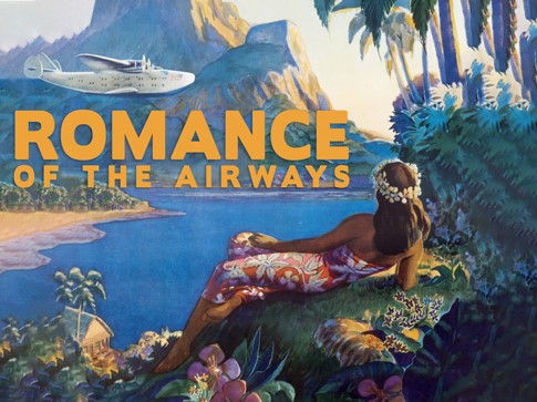
Romance of the Airways
September 20 - October 5, 2016
We are excited to announce our exhibition Romance of the Airways: Pan Am's Timeless Posters of the 1930s featuring 13 rare posters that capture the golden era of flying on Pan Am's remarkable Flying Clippers prior to WWII.
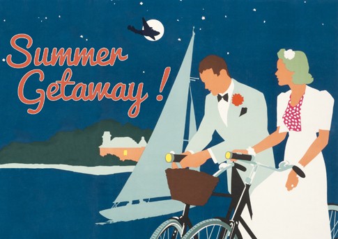
Summer Getaway!
July 5 - September 5, 2016
International Poster Gallery proudly presents "Summer Getaway! 23rd Annual Summer Poster Show," including more than 50 original vintage travel and leisure posters from near and far, plus a new discovery of 30 rarely-seen airline posters.
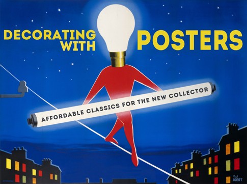
Decorating with Posters
April 5 - May 12, 2016
International Poster Gallery proudly presents "Decorating with Posters: Affordable Classics for the New Collector," a show and sale of original vintage posters from $250 to $2500 that reveal why the field remains one of the best for newcomers. The show features fine examples from several styles, subjects, and eras to indicate the incredible breadth of opportunities for any budding collector or home decorator.
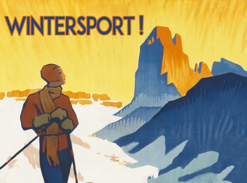
Wintersport
February 4 - March 15, 2016
We are proud to announce our exhibition, "Wintersport! Prized Vintage Posters from the Golden Age of Skiing 1900-1960", which features many rarely seen and highly desirable posters from the Golden Age of Skiing. The show will be on exhibit in our Newbury Street gallery in Boston from February 4th to March 15th, 2016.
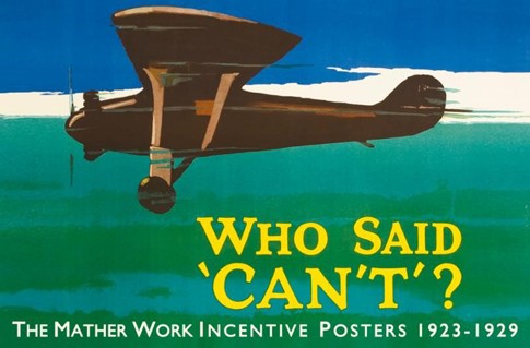
Who Said "Can't"
October 1 - November 15, 2015
In 1925, President Calvin Coolidge famously declared, "The chief business of the American people is business... The chief ideal of the American people is idealism."

Endless Summer
July 4 - Labor Day, 2015
July is here and eternal summer is in the air!
We are celebrating the spirit of the season with our 22nd Annual Summer Poster Show. The joys of beach, travel, music, sport, fine food and spirits from the 1890s to the present are featured in more than 50 vintage posters on exhibit in our gallery. Some highlights:
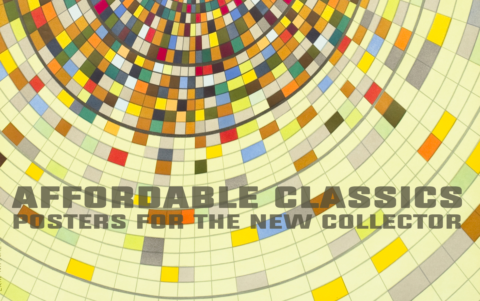
Affordable Classics
March 24 - April 30, 2015
International Poster Gallery proudly presents "Affordable Classics: Posters for the New Collector," a show and sale of 50 original vintage posters under $2500 that reveal why the field remains one of the best for newcomers. The show features fine examples from several styles, subjects and eras to indicate the incredible breadth of opportunities for any budding collector or home decorator. The show will highlight several of the most interesting areas:
Art Deco has never been more popular than today, from its earliest luxurious beginnings in France from about 1909 through the 1920s, to a modern streamlined and mechanistic style in the 1930s and 1940s. A stunning example of French Art Deco is Charles Loupot's Fourrures Canton. First issued in 1924, with color variations, it was popular right up to its final edition in 1949. Another striking poster is the 1948 Atelier Perceval poster for Air France with a hippocampus, a mythical seahorse that was Air France's logo, emerging from the reflections of the spinning airplane propeller.
A strong area of interest with many opportunities for new collectors is the Mid-Century style of the 1950s and 1960s. Two distinct styles emerged post-World War II, fed by the Baby Boom and the rise of international consumer brands. The first, which some today call "Madmen" style after the popular television series, was brightly colored and whimsical. One of the most successful series was created by California artist David Klein for TWA. His ingenious poster for Las Vegas, 1957, is an iconic example of the hip "Ratpack" era.
Another perennial 1960s favorite is the original poster for 3 Days of Peace & Music - Woodstock, 1969 by Arnold Skolnick. Reproduced, reprinted and satirized hundreds of times, the original is a valuable collector's item and hard to find. The other dominant Mid-Century style that emerged has been dubbed the International Typographic Style or Swiss Style. More orderly and rational, it often conveyed its message through the innovative use of typography. One of the most notable series of posters in this style was created by the Swiss typographic master Josef Muller-Brockman for the chamber orchestra Musica Viva from the late 1950s through the early 1970s.
Travel and transportationposters from around the globe are another blockbuster poster category, and the gallery has over 1500 examples from the birth of the travel poster from the 1890s to the present. Classic examples include Daniele Buzzi's colorful poster for Locarno, 1926; Austin Cooper's exotic design, See India, c. 1930; and The Largest Ships to and From California, 1929 by L. Wulff for Panama Pacific ocean liners.
The show features numerous other categories, as well as a number of smaller graphics, many already framed and available for under $100. Vintage luggage labels are a hugely popular category, especially for newcomers. Worldly individuals were given the chance to show off their adventures, all the while serving as walking billboards.

Timeless Journeys
July 14 - September 2, 2014
We proudly present Timeless Journeys: Our 21st Annual Summer Show. Travel posters awaken our dreams of adventure, nostalgia, beauty, and wanderlust perhaps more than any other poster category. Experience traveling to these exotic vistas with more than 50 posters from the Golden Age of Travel to Mid-Century Modern. Highlights include early Pan Am posters, a spectacular range of Air France posters, and smaller graphics such as luggage labels.
The headliner of the summer show is San Francisco - Hawaii Overnight! Via Pan-Americancirca 1939. In January 1939, Pan Am's Boeing 314 made its first scheduled flight from San Francisco to Hawaii, dubbed the Honolulu Clipper the seaplane landed in just 20 hours, its 36 passengers enjoyed gourmet dining, dressing rooms and bunk beds to travel 2,500 miles, capped by a delightful native greeting on arrival. The poster captures the romance of travel as well as the pandemonium and novelty that met the plane upon its landing in Pearl Harbor. It is believed to be the work of Frank McIntosh, who came to fame in the 1920s creating a series of Art Deco covers for Asia Magazine and later menu cards for the Matson Line Steamship Line.
The exhibition also includes a large selection of posters from Air France, which was formed in 1933 from four different airlines. According to Gallery Director Jim Lapides, "From the beginning, Air France produced superb posters that over time made it one of the best airline series ever created. We have some of the earliest and most historically significant designs in the show, including the first one produced for an African route, and the first from 1947 when the airline recommenced flights after World War II. Indeed, unlike most rivals, Air France continued into the 50s and 60s producing classic lithographs from top artists promoting its world-wide network."
Closer to home is Joseph Binder's New York World's Fair 1939 which combines images of planes, trains, and ocean liners with the majestic Trylon and Perishpere symbols of the New York World's Fair. The classic Art Deco image, thousands of which were sold to the 44 million attendees of the fair, is now very hard to find. It captures New York's unbridled spirit and optimism even in the face and depression and world war.
On a smaller scale, the summer show features a wide collection of vintage hotel and airline labels. These popular small graphics came into vogue around 1900 and represent one of the first successful viral marketing concepts -- travelers proudly advertising their destinations and hotels wherever they went. Leading printers around the globe created beautiful labels for hotels shipping lines and airlines well into the 1950s, such as the striking Semiramis Hotel - Cairo circa 1930.

Tour de Force
May 1 - June 30, 2014
We proudly present Tour de Force: Our 20th Anniversary Show, an exhibition of 40 poster highlights that echo some of our special areas of interest.
The exhibition opens with classics from the 1890s, the lithographic poster's first decade, which is often called the Golden Age of the Poster. It takes its cue from Eldorado, Toulouse-Lautrec's iconic portrait of an imposing Aristide Bruant announcing his performance at his famous Parisian cabaret in 1892. The poet and balladeer was famous for his sharp-tongued musical reviews that shocked and enthralled Parisians. Toulouse-Lautrec only produced 31 posters before his untimely death in 1901, but his pioneering efforts, this one of his earliest, would fuel a poster craze through the decade and forever elevate the poster as an artistic medium.
Another highlight of the show, which looks back to the Gallery's pioneering exhibitions on the Italian poster, are two superb rarities. The first, dating from 1912, is a large format fashion poster by Marcello Dudovich for the pioneering Italian retailer, E & A Mele. The elegant portrait of a Neapolitan beauty in a printed coat and hat makes as imposing an impression as Toulouse-Lautrec's creation. This is joined by Leopoldo Metlicovitz's poster for the 1907 Milan Automobile Show, which shows a race between a car and winged Mercury at dusk. It is one of Italy's most famous posters, and extremely rare.
The next focus of the show is the Twenties and Thirties. A stand-out collectible is the large format Art Deco poster for the first soccer World Cup in Uruguay in 1930, produced by the General Match Company of Montevideo. This highly abstract work shows a goalie reaching for a ball heading for the corner of the net. Another unusual design is a London Underground poster for an extension on the Morden Line in 1926 which uses a clever graphic solution to communicate its message powerfully.
A third section focuses on Mid-Century design. Most interesting is a never before seen life-size maquette, or preparatory painting, by Herbert Leupin for an Object Poster for PKZ, the Swiss men's clothier. It shows an extremely detailed label for the company, with a needle and thread that have just completed the last stitch. It is unknown why this poster was not put into production. Leupin created posters for PKZ in 1939 and 1942, and thought it special enough to retain in his personal archive.
Other highlights include:
Travel posters by leading artists AM Cassandre and Roger Broders
Skiing and bicycle posters by Maurer, Diggelman, Cardinaux and Roowy
Ocean liner posters such as Odenvinge's moonlit Lusitania poster, circa 1907
Rarely seen Work Incentive Posters from Mather
Propaganda posters from WWI, WWII and the Soviet Union
Aviation posters from Lazzaro, Lawler and David Klein
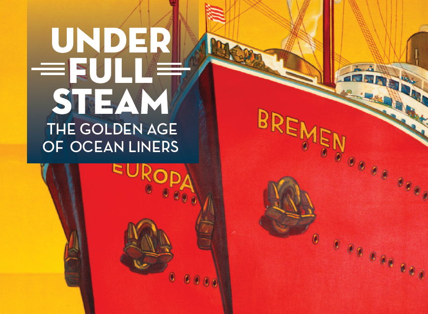
Under Full Steam
May 7 - September 6, 2014
Along with Grand Circle Gallery, we are proud to present Under Full Steam -The Golden Age of Ocean Liners, a stunning exhibit of vintage travel posters promoting travel by steamship from the late 19th century through 1960. The exhibit is on display at Grand Circle Gallery, 347 Congress Street, Boston.
More than 30 vintage posters, most of which are on loan from us, transport visitors to a bygone era when the ocean liner was "the only way to cross" in more ways than one. Of all travel experiences, few can rival the romance and adventure of an ocean crossing on a "floating palace" like the Mauretania or the Queen Mary.
The show begins in 1890, when steamship companies began advertising their first "superliners" with another new marvel, the lithographic poster. It concludes with the onset of the Jet Age in 1960, when the jet reduced intercontinental travel to mere hours rather than days, forcing the ocean liner to reinvent itself as the cruise ship.
The posters are exhibited in five major groupings chronicling the history of ocean liners:
Samuel Cunard and the Birth of the Modern Ocean Liner (1840-1897)
Rivalry on the Seas (1897-1918)
Post WWI: Recovery and Reinvention (1918-1928)
Ships of State (1929-1939)
Postwar: The Last Liners and the Rise of the Cruise Ship (1945-1960)
Owner of IPG Jim Lapides worked closely with Grand Circle Gallery in preparation for its opening in 2010, lending his expertise in the travel poster genre.
"This is the continuation of a delightful collaboration between IPG and Grand Circle Gallery," he said. "The Golden Age of the Ocean Liner touches all the currents of world history through 70 turbulent years: competition among nations, technological revolution, immigration, economic boom and bust, wars, and sociological changes that brought us 'Floating Palaces,' tourist class and steerage. For Bostonians, it is especially fascinating to witness the vital role that the city played in this exciting story."
"Equally compelling is tracing the very posters which promoted the liners, from the early 'information style' designs overloaded with maps and schedules to the highly graphic works of A. M. Cassandre, who revolutionized the poster with his streamlined Art Deco style. Many of the best posters of the genre can be seen in this blockbuster show."
Grand Circle Gallery hours are Wednesday and Friday, noon-6:00pm; Thursday, noon -7:00pm and Saturday, 10:00am-5:00pm. Admission is FREE and the gallery is handicap accessible. For more information, please visit www.gct.com/grandcirclegallery or call (617) 346-6459.
View all Ocean Liner posters here!

Influential by Design
March 26, 2014
As part of Boston Design Week and in collaboration with swissnex Boston, International Poster Gallery presents a gallery tour with featured speaker, artist, designer and poster collector Chris Pullman, and gallery owner Jim Lapides. Mr. Pullman currently is Senior Critic of the Graphic Design Program at Yale University and formerly the Vice President for Design and Branding at WGBH. The program accompanies a one-day exhibition and sale of poster masterpieces drawn from the Gallery's world-leading Swiss collection. The posters illustrate Swiss design's leadership in creating a graphic vocabulary for the complex, global realities of modern society.
International Poster Gallery
205 Newbury Street
Boston, MA 02116
Registration requested through this link: https://swissposters.eventbrite.com
Refreshments to follow.
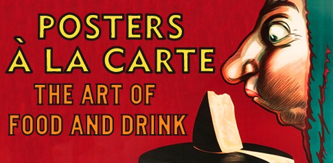
Posters a la Carte
October 1 - December 1, 2013
We proudly present Posters a la Carte, an exhibition of 50 original vintage Food & Drink posters from the Belle Epoque to the Sixties. The show traces the use of posters by the food and beverage industry, from Absinthe to Coca-Cola and from Foie Gras to Jello. The show focuses on the fascinating approaches taken by poster artists to make their ads memorable - humor, sex, caricature, fantasy, charm and eye popping tromp l'oeil affects, among others.
The new advertising medium of the lithographic poster became one of the most visible symbols of the Belle Époque, the "Beautiful Epoch" of the 1890s in Paris and in major cities in Europe and the US. Along with posters of travel, entertainment, fashion and politics, food and drink posters proliferated on city walls, as many of the products became staples for the burgeoning middle class. Paris alone had nearly 30,000 cafes in 1895, and the whole of France claimed 435,000 - one for every 80 inhabitants! Drinking was a way of life, and by 1890 beer and wine were but two of the most popular.
The exhibition begins with a classic 1894 poster by Jules Cheret, the father of the color lithographic poster, for the French tonic wine Vin Mariani, which until 1910 was spiked with cocaine. Effortlessly floating through the air, a beautiful "Cherette" pours a glass and seems to express the carefree pleasure of the age. Two other works in the exhibition capture the essence of the era. Absinthe Parisienne of 1896 reveals the naughty side, with a sorcerer in black tempting a young damsel with the tag line "Try it and you will see." And T.A. Steinlen's famous 1894 portrait of his daughter giving milk to her cats in Lait Pur Sterilise de la Vingeanne captures the era in its most charming intimacy.
At the same time as spirit makers were evolving into large enterprises, some food categories such as olive oil, chocolate, biscuits, pasta and cheese became commercially significant as well. A wonderful example is the little schoolboy ad Lulu Biscuits by Firmin Bousset printed originally in 1897 for Lefevre Utile, a large manufacturer still in existence today.
The new century brought a host of new products and manufacturing sophistication. In 1900, leading product poster artist Leonetto Cappiello would make hundreds of these products well known and unforgettable through humor, bright color and wild metaphors. What better way to promote a "pick me up" drink than to show a playfully devilish statue of a satyr coming to life while drinking it through a straw, as in his Menthe Pastille of 1906, Achille Mauzan, another top artist, created a timeless close-up for Bertozzi Parmiggiano in 1924 of 3 elderly Italians crowding around a cheese wheel, savoring its aroma.
The Art Deco era of the 1930s, while creating many streamlined, modernist images for food and drink products, did not abandon the use of humor either. Marcello Nizzoli in 1926 created two stunning Cubist inspired posters for Campari, the leading Italian aperitif that had commissioned first-rate posters continuously since the 1890s.
The Germans and especially the Swiss pursued the Object Poster, a simple but dramatic style that eliminated most text and focused on the object. A fine example is Herbert Leupin's 1939 poster for Bell of a gigantic carving board with cold cuts and bacon - a visual shock with a touch of levity in the pickle used as garnish. A.M. Cassandre, the most important poster artist of the era, created perhaps the most famous advertising character for Dubonnet that merged Art Deco style with the Cappiello approach in 1932.
The Fifties would witness the rise of the global brand, and the poster adapted to the baby boom economy. The predominant style was relaxed, playful and youthful. Perfect examples from the show include Herbert Leupin's series for Coca-Cola, Pepita and Eptinger, and some anonymous American posters for Jello.
The exhibition will conclude with a small group of posters from World War I and II for food conservation, an essential factor in the Allied success in both wars.
Food and beverage posters comprise one of the most popular categories of vintage poster collecting, and are perennial favorites in kitchens and dining rooms as well as in bars and restaurants.
States IPG President Jim Lapides: "Even after decades of vintage poster collecting, many superb posters in this category are surprisingly affordable and offer great opportunity for new and sophisticated collectors alike."
View all food and drink posters.

That's Amore!
June 18 - September 2, 2013
Wanderlust is the theme of our 21st annual Summer Show titled "That's Amore" - Travel Posters to Love." The exhibition traces the fascinating development of travel posters to Italy, the "Sunny Boot of Europe," from the rise of the railroads in the 1890s to the 1960s. Featuring more than 100 original vintage travel posters, the exhibition is rounded out by a select group of fine travel posters from around the globe.
Initially, only the wealthy could afford the time and expense to go to Italy, which had grown in popularity in the Middle Ages as an important pilgrimage destination and later as a cultural and scenic wonderland. This changed with the rise of the railroads and the completion of massive tunnel projects through the Alps at the end of the 19th century. The show opens with Al Lago Maggiore, a 1906 poster highlighting the recent completion of the Simplon Tunnel, which provided the first direct train route from Paris to Milan with glorious views of the Italian Lake Region along the way. Tourism, much delayed in Italy, was finally in order.
These first Italian travel posters were produced by the railroads, like Al Lago Maggiore, but a second wave began in 1919 with the birth of the Italian National Tourist Bureau (ENIT). This government sponsored agency commissioned numerous posters to promote Italy?s world-class tourist destinations. Its efforts plus faster rail and ocean liners, the rise of a vibrant ex-pat population, and the explosive Roaring Twenties economy caused Italian tourism to blossom. A fine example, Venedig und Lido, circa 1925, by Vittorio Grassi, is a dreamy poster promoting Venice and its Lido beaches, published in several languages including German.
The Thirties were a time of challenge, as the Depression and international tensions threatened the tourism industry. Mussolini redoubled efforts to attract tourists. ENIT commissioned fine artists such as A.M. Cassandre, Marcello Dudovich and Marcello Nizzoli to promote Italian cultural attractions. The show includes a rare 1930 ocean liner poster by Giuseppe Riccobaldi, Navigazione Generale Italiana, one of three companies that merged into Mussolini's Italian Line two years later.
Shrewd marketers for Italian hotels and ocean liners capitalized on the power of the tourist boom to create one of the earliest forms of viral marketing, the luggage label. These beautifully designed mini-posters were glued to the suitcases of status-conscious travelers, who gladly served as walking billboards.The gallery is offering a special selection of these beautifully designed and printed labels, many produced by the famed Neapolitan printing house of Richter, including designs by Mario Borgoni and J. Pashal. View all luggage labels.
The revival of travel after World War II developed slowly. The Italian postwar economic "miracle" once again made Italy a leading destination. Fellini's classic film La Dolce Vita and Italian fashion positioned Italy as a land of style and beauty, which was successfully promoted around the world in ENIT posters.
The exhibition concludes with a smorgasbord of spectacular posters from India, Morocco, Switzerland, France, England and Australia, as well as several famous posters for Cunard, Air France and Pan Am.
Browse featured posters.
View all Travel posters here!
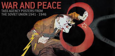
War and Peace
May 1 - May 7, 2013
International Poster Gallery is proud to present War and Peace: TASS Agency Posters from the Soviet Union 1941 - 1946, a one-week only show and sale of extremely rare News Agency "window" posters from the Soviet Union. Posted daily in shop windows of Moscow after the German invasion in 1941, TASS posters were intended to rally support for the war, and later the post-war, effort. The gallery is offering its complete collection of 44 large format, intricately hand-stenciled TASS posters, many never before exhibited in the U.S. View all panels.
In the two days following Hitler's massive 1941 invasion of Russia, three leading artists met with government officials to establish a studio that would produce posters through the government sponsored TASS News Agency. Inspired by the highly successful Russian Telegraph Agency (ROSTA) windows from the Bolshevik Revolution, the first TASS window was produced on June 27, 1941 to reassure and galvanize the public and the country's allies.
In all, 1,485 TASS windows were created over the next 5 and a half years, spanning the war's early moments of utter desperation to the ultimate victory over the Axis nations. Artists utilized a broad arsenal of visual strategies to both incite and inspire: from vicious satire, to potent slogans, to undiluted horror and hatred, to patriotic historical parallels. The collection on display at International Poster Gallery features rare TASS panels dating from March 1943 to late 1946 as the scales slowly tipped in the Soviets' favor, and beyond the armistice.
A pivotal Soviet victory is portrayed in window #891, Novgorad-Volynskii is ours!. In January 1944, the Soviets concentrated their largest artillery barrage to date to reclaim Nazi-occupied Novograd. In this panel, Nazi soldiers are seen fleeing the recaptured city, a fine example of what would become a recurring theme of the collection. The poster's cocky tone is both visually and lyrically evident in its text: "Novgorad-Volynskii is ours! Having taken copious blows, Their legs no longer obeying them, The Fritzes go mad en masse and whirl away faster than the wind." Indeed, the Soviets would conclude the campaign one week later with the liberation of Leningrad after a 900-day occupation.
Biting satire was the specialty of the Kukryniksy, a triumvirate of sophisticated and witty visual artists. Panel #993 from June 1944, Three Years of War, is one of their most powerful designs. In this poster, a large pincer squeezes Hitler's head as he struggles against it to no avail, bending before the implacable Soviet force. His gold "thunderbolt" cuff band breaks, signifying the fate of the German blitzkrieg. The pincer is cleverly comprised of a large red Soviet number 3 - referencing the pivotal Third Year of the TASS campaign.
As victories piled up, TASS designs abandoned much of their venom for messages of unity, thankfulness, and recovery. One of the most colorful panels in the series is #1149, Salute, from early 1945 when the Third Reich was weakening. Fireworks explode over Red Square as a crowd pays tribute to the sacrifices of their countrymen. Beginning after Spring 1942, a labor-intensive printing method was introduced that employed dozens of colors (and stencils) in each design to better hold the viewer's attention and project more memorable imagery. As the windows were also distributed to the Allies, it was believed that the higher quality would make a stronger impression overseas.
Much of the final 18 months of TASS window production would be celebratory and instructional in nature, promoting Stalin's regime and victories in Europe and Japan. The Gallery's collection includes tributes to the Navy, tank commanders, the air force, bricklayers, collective farmers and even suppliers of consumer goods. The TASS windows, no longer urgent, were discontinued in late 1946 as the task of reconstruction became successfully institutionalized.
"Until two years ago, TASS panels were virtually unknown in the U.S., more or less forgotten since Margaret Bourke White photographed them in 1941," comments Gallery owner Jim Lapides. "So we are particularly pleased to be able to present such a powerful and stunning collection filled with such rarities at the gallery." Due to their rarity and historical value, the group of 44 panels will be sold as a collection.
A recent review of the exhibition by wbur.org (Boston's NPR station): 'All roads lead to Berlin!': Soviet Artists Fight The Nazis In WWII.
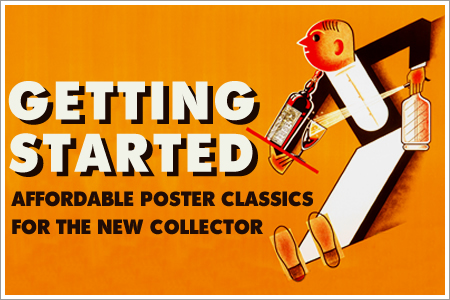
Getting Started
March 12 - April 30, 2013
Also on display: War and Peace: TASS Agency Posters from the Soviet Union 1941 - 1946.
International Poster Gallery is proud to present Getting Started, an exciting show of original vintage posters under $2,500. The exhibit includes many examples that reveal why the poster field remains one of the best for new collectors. The show presents works by renowned poster artists such as Howard Chandler Christy, Leonetto Cappiello, Herbert Leupin, Otto Baumberger, and many more.
War and Propaganda posters are one of the largest areas of poster collecting, due to their high quality, reasonable prices, and historical interest. Howard Chandler Christy's 1917 poster Fight or Buy Bonds is a great example that sells for under $1,000 in excellent condition. The show also includes other war subjects, such as rationing, shipbuilding, and home front efforts.
Art Deco is an equally popular collecting category, and fine examples can be found. Sepo's 1930 poster for the French apertif Picon features a bright color palette, angular lines, and a playful spirit. It is hard to match in value, and can easily serve as the focal point in almost any setting.
Leonetto Cappiello is considered the father of modern advertising, creating close to 1,000 product posters between 1900 and 1950. While some of his designs fetch steep prices, some classics are still affordable for a new collector. The best example of this is Le Nil, a 1912 poster for a cigarette rolling paper so strong that the artist chose an elephant to symbolize the brand. The horizontal format is desirable, as most vintage posters were designed in a vertical layout.
Those with an appreciation for Cappiello may also enjoy Herbert Leupin's playful posters. A Swiss-born designer of almost 90 Swiss Poster of the Year awards, Leupin's classic Fifties poster Pause, advertising Coca-Cola, is featured in the show.
Soviet posters from all eras have become a very strong collecting category. Many posters from this era, including the anonymous 1927 cigarette advertisement at left, feature sophisticated Constructivist design, and make great starter pieces for the new collector.
Travel is another sought-after collecting category, and the gallery has over 1,500 examples of travel posters. Included in the show is Rene Gruau's Relax (1954), created for the French-based cruise line Compagnies Maritimes. Featuring an Audrey Hepburn look-alike enjoying a carefree day at sea, a fine example of the poster is available at the gallery for under $2,000.
Also included in the show are a number of smaller graphics, many framed and available for under $100. Vintage luggage labels, like the Grand Hotel Hawaii, are hugely popular. These beautifully designed labels were affixed to suitcases of intrepid travelers as a scrapbook of exotic destinations.
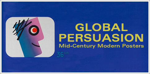
Global Persuasion
October 4 - November 21, 2012
"Global Persuasion: Original Mid-Century Modern Posters," a selection of posters spanning 1945-1965, celebrates the broad spectrum of motifs and styles that arose in response to the technological and cultural developments following the end of World War II.
Including 35 examples of significant Mid-Century Modern design, the show presents work by pioneers such as Herbert Leupin, Erik Nitsche, Armin Hofmann, and David Klein, as well as others both well and less known.
Browse all mid-century modern posters.
The Post-War World
Despite the looming tensions of the Cold War, a sense of peace and prosperity settled throughout much of the world at the end of World War II. Populations rose dramatically, and technological advances such as the arrival of television and the commercial jetliner helped make the world seem like a much smaller place.
Advertising methods shifted to adapt to the times. A veritable "poster boom" occurred in the early 1950s, driving forward two distinct styles, one consumer and one corporate. The first, which we have labeled the '50s Style, was brightly colored and whimsical, while the second, called the International Typographic Style, was more rational and orderly.
The Rise of the Global Consumer
Posters done in the '50s Style used vivid colors and playful motifs to appeal to a broad audience, and the style became the dominant look of consumer advertising. Artists like Herbert Leupin and Donald Brun in Switzerland, Paul Rand in the US, and Raymond Savignac in France exemplify the lighthearted qualities of this style.
Featured in Global Persuasion is Leupin's 1952 poster for Pelikan, a Swiss manufacturer of fountain pens. The company's pelican mascot becomes a stylized, geometric cartoon holding photorealistic depictions of Pelikan products. Typical of a Leupin design, Pelikan reveals a rich, personal universe of characters, symbols, and animals to attract and delight the child in everyone.
The '50s Style was applied to consumer services as well as products. Airline campaigns sought to attract travelers to destinations like Disneyland, New York, Las Vegas, and Paris. The work of David Klein for TWA and Stan Galli for United epitomize these campaigns. Klein's magical nighttime view of the Hollywood Bowl was particularly successful. A colorful and brilliant scene shows tall palms and dynamic spot lights rising into the sky toward twinkling stars and a TWA jet. The airline printed the poster twice, first in the late 1950s with a prop plane, and again in the early 1960's with a jet, as seen in the exhibition.
The Rise of the Global Corporation
The International Typographic Style, or Swiss Style, was also perfectly suited to the increasingly globally connected world. Highly structured, systematic designs granted order and clarity to everything from highways and airports to product instruction manuals.
Influenced by the Bauhaus and Tshichhold's New Typography, this style developed in Switzerland in the late '50s and '60s. It employed basic typographic elements with strict graphic rules and often replaced illustration with stark, "modern" photography. The concert posters of Josef Muller-Brockmann represent the classical apotheosis of this style - cool, elegant and systematically abstract.
Another fine example is Erik Nitsche's "Atoms for Peace" poster for General Dynamics. In 1955, Nitsche became Art Director for the company, a leading multi-division technology firm most famous for building the first nuclear submarine. There, Nitsche created a series of spectacular posters for the first International Conference on the Peaceful Uses of Atomic Energy.
Mid-Century Modern Today
The Mid-Century poster genre represented a monumental shake-up in the field of graphic design and has seen a meteoric rise in popularity in recent years. Artists adapted to the evolving mentality of post-war consumers with unprecedented style, and are now securing their status as Mid-Century icons. Like the 50's Style, the use of International Typographic Style spread rapidly, and is still the leading design language of the modern world.

Postermania!
July 4 - September 3, 2012
We are proud to present Postermania!: Handpicked Summer Favorites, a show and sale of original vintage posters chosen by the gallery's knowledgeable staff. The term "Postermania" was originally coined during the Belle Epoque and refers to the poster fever that swept Paris during the 1890s. Fittingly, the gallery's 19th annual summer exhibition features a diverse selection of posters by subject, genre and period, each selected by IPG staff members to reflect their individual tastes. Included are works by renowned poster artists like Edward Penfield and Roger Broders alongside lesser known, but remarkable staff favorites.
The centerpiece of the summer exhibition is Arnold Skolnick's celebrated 1969 poster for the Woodstock Music Festival, "3 Days of Peace & Music" . A true rock and roll icon, the poster played an essential role in the success of the largest rock concert of the '60s, an event that was as famous for its freedom from violence as it was for its remarkable music lineup. It perfectly expressed in one symbol - a dove perched on the neck of a guitar - the spirit of Woodstock and devotees. Despite its need for lengthy text (which contains a treasure trove of information on the festival), the poster was as graphically succinct as any by Cappiello. In addition to this original Woodstock poster, IPG also offers an exclusive 40th anniversary Woodstock poster designed by Arnold Skolnick, printed in a limited edition and signed by the artist.
Other Postermania! favorites include Walter Cyliax's joyful poster for a flower festival in Zurich. Blumenfest is an explosion of shapes and high-contrast colors, rendering an array of beautiful blossoms with deft Modernist sensibility. Cyliax was enormously versatile and strongly believed, like his Bauhaus contemporaries, that clarity was the most important principle of design.
Edward Penfield's Join the United States School Garden Army - Enlist Now is another gallery favorite. Penfield's poster for the War Garden Commission, itself a remarkable volunteer effort, is one of the best of World War I. Roughly 5 million war gardens, now called victory gardens, fed United States citizens during the conflict, while committing massive shipments to aid beleaguered allies in Europe.
Another top pick is Walter Herz's 1948 poster for Pan Am, advertising travel to the summer Olympic Games in London. The poster tells a rich and timely story. In 1939, the Olympics were awarded to London for the 50th anniversary of the Games (to be held in 1944), but were cancelled due to World War II. After the War, London was chosen to host the Games in 1948 despite wartime damage and the strict austerity of its postwar economy. Herz's design paints a picture of a prosperous and celebratory London, combining the symbolism of the ancient games in the classical Greek sculpture of Discobolus with the five interlocking rings of the Modern Games.
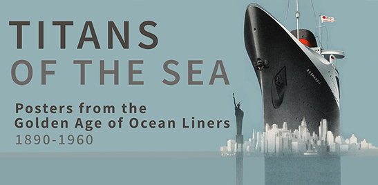
Titans of the Sea
April 16 - June 15, 2012
:Titans of the Sea: Posters from the Golden Age of Ocean Liners", features a selection of the greatest vintage ocean liner posters, ranging from the birth of the "Floating Palace" in the 1890s to its decline in the Jet Age of the 1960s.
The show, commemorating the 100th anniversary of the sinking of the Titanic, and one of the largest of its kind ever offered by a gallery, explores the romance and adventure of ocean travel with 35 extraordinary selections from a recently acquired 200-poster collection. Included are works from major lines like Cunard, White Star, French Line, and many others.
Browse all ocean liner posters
The Beginning
The innovation of steam power in the 19th century opened the world to a Golden Age of ocean liner travel. Fueled initially by the need for reliable mail delivery and a transportation network for the British Empire, the industry saw an explosion of popularity during the "Great Atlantic Migration" that brought 29 million immigrants to the U.S. between 1871 and 1914.
By the turn of the century, ocean liners began to compete through luxurious first class quarters on the upper decks. Posters for Cunard's Mauretania (launched 1906) and White Star's Titanic (1912) advertised veritable Floating Palaces that rivaled the opulence of the era's grand hotels. Huge capital investments, national pride and defense concerns entangled governments and private companies in their battle for supremacy on the high seas.
This show includes towering masterpieces of this glamorous era. Featured are a rare horizontal format poster by Sebille of the SS. France (1912), and Rosenvinge's majestic Cunard Line (1914), portraying the newly launched Aquitania heading out to sea under full steam. A cutaway view of the same ship reveals the inner workings of a Floating Palace that led to the advertising phrase "the only way to cross."
World War I
The beginning of World War I brought an abrupt halt to the boom in ocean liner travel, with many civilian ships converted for military duty. The Lusitania, a passenger ship in the Cunard Line, was sunk by a German U-Boat in the early years of the war. The tragic event swayed public opinion against Germany, as can be seen in a rare Irish recruiting poster featured in the show.
Between the World Wars
However, developments in more efficient propulsion technologies and the creation of the "Tourist Class" passenger cruise reinvigorated the industry after the war. Some posters of the era capitalized on these innovations, while others continued to use more traditional imagery, like the poster in this exhibition for America's Leviathan, 1925.
Despite the worldwide Depression, some of history's most spectacular ships were launched in the late 1920s and early 1930s. The arrival of the Normandie in 1935 signaled the apex of this Golden Age. It was the largest and fastest ocean liner, able to cross the Atlantic in little more than four days, and the ultimate expression of the artistic and scientific genius of France.
Posters of this era are classics, and are well represented in this show. Most are executed in a streamlined, Art Deco style, led by 5 posters by A.M. Cassandre. Notable highlights include his most difficult to find and spectacular images l'Atlantique (1931) and Normandie (1935), which capture the scale and power of these Machine Age wonders.
World War II & Post-War
The ongoing global depression and rising international tensions brought an end to this relaxed world, and when World War II broke out, orders were given to convert the Normandie, the Queen Mary and Queen Elizabeth into troop carriers.
The war years inspired intense development of faster, more reliable aircraft, which ushered in a decline in the popularity of travel on the high seas after the war. The Golden Age of the Ocean Liner nevertheless continued into the Fifties and early Sixties, often on refurbished liners, but also on a few new super liners such as the SS United States (1952). Only in the 1980s has the resurgence of ocean liner travel created a renaissance in ocean cruising.
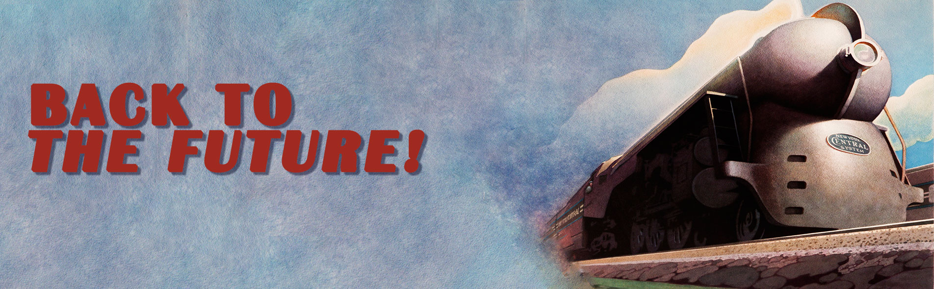
Back to the Future
February 6 - April 1, 2012
International Poster Gallery proudly presents "Back to the Future: Posters for a Brave New World," an exhibition of original vintage posters that heralded the revolutionary technological and social innovations of their respective times. The show features over 50 original vintage posters advertising fast trains, exotic vacation destinations, new household conveniences, and more.
Technological innovation breathed new life in to rail travel in the 1930s with the introduction of "Streamliners" -- aerodynamic, futuristic trains that were luxurious and fast. Perhaps the most famous was the New Twentieth Century Limited, commissioned by the New York Central Lines in June 1938. Commercial artist Leslie Ragan was tasked with promoting this exciting and monumental development in the realm of rail travel, and created what would ultimately become one of the most sought after American railroad posters of all time. His Art Deco design for the Twentieth Century is a paragon of the streamline aesthetic, and it's bold lines of perspective provide a sense of scale to his subject that can only be described as monumental.
Also included is Joseph Binder's iconic design for the 1939 New York World's Fair. The majestic symbols of the Fair, the towering Trylon and Perisphere, combine with images of plains, trains and ocean liners to announce an international age of travel. Binder's classic image is now quite rare, being one of the most popular Art Deco images created in the United States. It captures New York's unbridled spirit of dynamism and optimism, even in the face of a global depression and the imminent world war. Presenting the "World of Tomorrow," the fair attracted 44 million attendees over two seasons.
Illuminating the exhibition's Art Nouveau offerings is a poster by Giovanni Mataloni for Brevetto Auer, a company offering home gaslight. The poster's subject, a scantily clad young female, holds a lamp in one hand and a giant sunflower in the other amidst swirling and geometric patterns of orange, aquamarine and tan. The inference is that the lamp is so bright that flowers grow as if in sunlight. This suggestive symbolist tour de force is one of the most important of early Italian posters, so popular in fact that it was one of only four Italian designs to appear in Cheret's "Maitres de l'Affiche," a portfolio of the very best posters from the Belle Epoque.
Additional posters on display include Francis Bernard's 1933 design for Arts Menagers Grand Palais, a French exposition for new household innovations; an Italian advertisement by Osvaldo Ballerio for a 1908 automobile show; Paul Rand's clever 1991 pictorial ad for IBM, featuring an "eye," a "bee" and the letter "M;" and a colorful 1955 Space Age ad for television sets by French poster designer Alain Cornic.
See photos of the exhibit here!
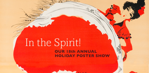
In the Spirit
December 1, 2011 - January 31, 2012
We proudly present our 18th annual holiday poster show In The Spirit!, an exhibition of original vintage posters that celebrate the mirth and indulgence of the season. The show features over 50 original vintage posters advertising entertainment, fine foods, exotic travel, luxury products, and more.
Highlighting the show is a 1902 poster by Maurice Biais advertising a performance of the Australian-born dancer Saharet. The poster features the world-renowned performer dancing a lively can-can, her bright red dress flourishing wildly across the foreground. Married to Jane Avril and a member of Toulouse-Lautrec's circle, Biais knew his subject well, capturing the wild and frenetic spirit of the French cabaret brilliantly. His posters are rare and few in number, and this one in particular reflects an economy and graphic power that is remarkable for the period.
Walther Koch's 1906 image of an ice-skater mid-stride is the perfect one to advertise travel to Davos, one of the "hottest" winter sports destinations in Switzerland. At the time, skating was the most important winter sport as skiing was just in its infancy. The Davos Ice Stadium was famous for its many international skating events and saw a great number of world record performances there as early as 1898. Koch's elegantly serene poster was so successful that it was used for several years, merely overprinted with event information at the bottom.
Next is Henry Le Monnier's vibrant 1926 advertisement for the French wine cooperative La Chablisienne. The poster features a beautiful woman draped in a flowing yellow dress, surrounded by grape vines as she perches atop the globe. Le Monnier created dozens of posters, all in a style similar to Cappiello but with a heightened Art Deco sensibility. Here his cheerful and creative style comes to the fore, with the powerful geometry of the design creating an image which is still used today by the winegrowers.
Also starring is a playful 1912 advertisement by H.L. Roowy for Michelin, featuring the company's popular mascot Bibendum, known colloquially as the Michelin Man. Bibendum, who first appeared in a 1896 poster by O'Galop, is one of the world's oldest trademarks and still represents the company today. In the ad, the cigar-chomping character pedals merrily along hands-free on a bicycle, dispensing the tires that comprise his mid-section to all he passes. The flying tires appear to leap off the page, crossing the border of the image's deep blue background and overlapping the advertising copy and leaving an indelible impression on the viewer.
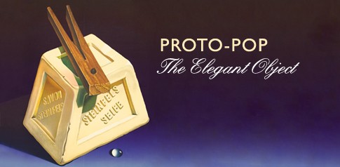
Proto-Pop
October 6 - November 24, 2011
We proudly present Proto-Pop: The Elegant Object, a first-of-its-kind exhibition of original vintage Object Posters from the Twenties to the 1940s, offered as precursors to the controversial and explosive Pop Art movement of the 1960s and 1970s. The exhibition, featuring over 30 posters from Object Poster masters, explores the points where the two movements converge, as well as contrast.
Featuring hyper-realistic drawings of everyday things, the Swiss Object Poster beginning in the Twenties focused on the beauty and precision of mundane industrial era products such as toothpaste, sunglasses, sneakers and household cleaners. These startling, larger-than-life advertisements foreshadowed by decades Pop Art's similar fascination with basic consumer products. Both styles elevate the commonplace object to a level of symbolism that elicits both shock and contemplation from the viewer. Though they display similar iconography, the Object Poster exalts the almost magical beauty of the object, while Pop Art uses the consumer object as an ironic symbol of rebellion.
Highlighting the show is a poster by Peter Birkhauser for the department store Rheinbrücke. Birkhauser, like his mentor Niklaus Steocklin, excelled at creating unforgettable icons out of everyday objects. The artist created more than 50 Object Poster masterpieces during the Thirties, Forties and early Fifties and this elegant poster is an excellent illustration of his skill. The crisp folds of the wrapping paper, the trompe l'oeil affect of the green string and the whimsical flip of the handle evoke an ideal of luxurious presentation, leaving the contents of the package to the imagination of the consumer. Pop prince Andy Warhol captured a similar aesthetic in his famous "Brillo Boxes" sculpture, relying on the object to tell a powerful, if altogether contrasting story. Both artists recognized the natural draw of the Object, and their works speak volumes on the pervasive consumer culture of their respective times.
Also featured is a poster by design titan Herbert Leupin for Steinfels soap. Leupin created approximately 500 posters over a 30-year period, beginning his career in the Thirties as an Object Poster specialist and then modifying his style after the war. His injection of marketing imagination and gentle humor propelled the style to the forefront of Swiss poster art. The inclusion of a trompe l'oeil water droplet in a poster for a laundry soap adds a playful touch to an eerily super-real still life of a giant wooden clothespin and soap bar. Such a poster, featuring prodigious draughtsmanship and painstaking lithographic skill, took roughly 10 to 12 weeks to produce. It is interesting to compare Leupin's work to Swedish sculptor Claes Oldenburg's monumental Clothespin of 1976. The public art installation, located on Market Street in Philadelphia, is a popular example of Pop Art's subversive idolization of the object as a symbol of an overly consumerist society.
The exhibition will include Otto Baumberger seminal PKZ coat poster of 1923, and Alex Diggelman's PKZ Box, neither of which utilize any superfluous text. There will also be important works from Niklaus Stoecklin, an Object Poster pioneer in Basel, as well as examples of Object Posters from other countries. Also included is a vintage shopping bag, screenprinted with the most recognizable icon of the Pop Art era, Andy Warhol's Campbell's Soup can.
View all of our Object Posters here!
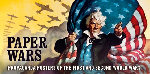
Paper Wars
April 28 - June 15, 2011
International Poster Gallery proudly presents Paper Wars, an evocative exhibition of original propaganda posters of the First and Second World Wars. The exhibition features some of the most persuasive and galvanizing posters from two of the most significant military conflicts in world history. From enticing recruitment posters to pleas for the civilian purchase of war bonds, these posters were a driving force of patriotism and propaganda in their respective homelands.
World War I was the first conflict in which the illustrated color lithographic poster was used as a means of propaganda. Already used in the world of commerce, travel, and entertainment before the war, illustrated posters provided an established and effective medium for propaganda delivery. With the outbreak of World War II, combatants once again pressed the poster into service, this time highlighting the conflict's polarizing ideological struggle that pitted Fascism and Totalitarianism against Democracy.
Highlighting the show's fine selection of recruitment posters is Howard Chandler Christy's 1918 call for naval recruits. The poster's subject, a smiling woman in a low-cut United States Navy uniform, is accompanied by the text "Gee!! I wish I were a man. I'd join the Navy." Supplementary text at the bottom of the poster urged the viewer to "Be a man and do it," directing them to a local navy recruiting station. Posters that appealed to period ideals of masculinity were quite popular and effective recruitment tools, often combining patriotic sentiment with sexually charged imagery for maximum effect.
A counterpoint to Christy's naval recruitment poster is Adolf Treidler's 1918 design for the YWCA. The poster highlights the emergence of the female work force during the First World War, stating "For every fighter, a woman worker." Women played an invaluable role in both World Wars, supplementing the sudden absence of their male counterparts in the workplace to assist in the war effort, most notably in the industrial sector. The YWCA advocated for women's rights in the workplace, limiting lengthy shifts, prohibiting night work and facilitating the organization of labor unions.
Lending his iconic and undeniably American style to the war effort, Norman Rockwell also participated in the United States propaganda machine with his 1943 "Four Freedoms" series. The series was inspired by a speech by Franklin D. Roosevelt, in which he described four principles for universal rights: Freedom from Want, Freedom of Speech, Freedom to Worship, and Freedom from Fear. The United States Department of the Treasure used Rockwell's paintings to promote the sale of war bonds, debt securities issued by the government to finance military operations during times of war. Rockwell himself considered "Freedom of Speech" to be the best of the four, an example of which is featured in the exhibition.
The show also features Joseph Leyendecker's war bonds "Weapons for Liberty" campaign sponsored by Boy Scouts of America; Lucian Bernhard's 1918 German World War I poster depicting an imposing iron fist; and Jack Campbell's virulent 1942 "Tokio Kid," a fine period example of the use of racial caricature to demonize the enemy.

Graphic Intervention
September 13 - December 4, 2010
International Poster Gallery owner Jim Lapides has amassed one of the largest collections of AIDS posters in the world -- more than 3,000 designs from nearly 100 countries. The collection is currently featured in Graphic Intervention: 25 Years of International AIDS Awareness Posters 1985-2010, a first-of-its-kind exhibition of arresting and fearless international public health announcement posters.
This exhibition presents a comprehensive overview of the diverse visual strategies employed to educate the public on the AIDS epidemic. The messages in Graphic Intervention champion issues such as disease research and eradication, world health, international relations, sexual education, and discrimination.
With over 3,000 posters to choose from, curators narrowed down the wealth of visual depictions to 153 examples from 44 countries. From Papua New Guinea to Denmark, Venezuela to Morocco, these posters demonstrate the remarkable diversity of visual solutions used to address a public health crisis.
A striking example is the American poster I have AIDS, Please Hug Me, evocative of a Dick and Jane drawing, which targeted the ignorance and fear aroused in 1985 when Ryan White, a hemophiliac with AIDS, was turned away from school. Another is the 1994 Australian design Condoman, directed at a young Aboriginal audience and intended to lessen embarrassment about condom use.
Graphic Intervention was curated by Elizabeth Resnick, Professor and Chair of Graphic Design at MassArt, and Javier Cortez, Partner and Creative Director at Korn Design, Boston. Resnick previously co-curated the exhibition The Graphic Imperative: International Posters for Peace, Social Justice & The Environment 1965-2005, which traveled extensively throughout the US and abroad from 2005-2010.
A 96-page full color catalog will be available for sale at exhibit events and on the website: www.graphicintervention.org
Exhibit Events:
Opening Reception
Thursday, October 7, 6:00-8:00 PM
The Stephen D. Paine Gallery located in South Hall
Visualizing Solutions: Designers and the HIV/AIDS Crisis
Thursday, November 4, 6:30 PM
Tower Auditorium
The exhibition is sponsored by International Poster Gallery, Korn Design, Sappi Paper, pixelslam, AIGA Boston.
Exhibition Travel Schedule:
Massachusetts College of Art and Design
Boston, MA | September 13–December 4, 2010
Art Center College of Design
Pasadena, CA | February 25–April 24, 2011
Art Directors Club
New York, NY | June 7–July 29, 2011
York College of Pennsylvania
York, PA | August 25–September 22, 2011
Museum of Design Atlanta, MODA
Atlanta, GA | October 1–January 1, 2012
Edinboro University Pennsylvania
Edinboro, PA | February 1–22, 2012
College of Creative Studies
Detroit, MI | March 2012
The Wolfsonian
Miami Beach, FL | May 11–September 9, 2012
Central Michigan University
Mt. Pleasant, MI | October 1–November 30, 2012
International Poster Biennale of Mexico (selections)
Querétaro, Mexico | November 2012
Big Screen Plaza at Eventi Hotel (slideshow)
New York, NY | World Aids Day, December 1, 2012
Johnson & Johnson Headquarters (selections)
New Brunswick, NJ | December 2012
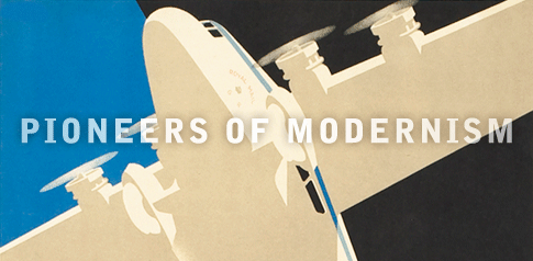
Pioneers of Modernism
April 24 - June 1, 2010
International Poster Gallery is pleased to announce "Pioneers of Modernism: Poster Masters of the 20th Century," a revealing look at how pioneering artists changed the rules of poster making throughout the century. The exhibition of 35 groundbreaking poster designs is now on view and runs through June 2010.
The exhibition is arranged chronologically, with highlights selected from four eras: the early Modernist period from the turn of the century to the early 1920s; the Art Deco style from the mid-1920s to WWII; the Mid-Century period of the 1950s and 1960s; and the Postmodern period from the late 1960s to the 1990s.
The show begins with some of the major designers who challenged the floral and organic Art Nouveau style of the 19th century. One highlight is Otto Morach's Swiss Artist Exhibition of 1918, which was the first truly designed typographic poster made in Switzerland. Utterly simple and elegant, its sensuous letterforms are reminiscent of the pioneering modernism of the Vienna Secession, while its restricted palette and chalky textures resonate with depth and warmth. Morach was the prototypical Swiss designer - trained in mathematics, he turned to painting and studied in Paris, Switzerland and Germany. He only designed a handful of posters, but each one is imbued with a modernist spirit that still inspires. All of the elements in Morach's work would become hallmarks of Swiss graphic design.
The show is replete with other fine examples of early Modernism. It includes an excellent example of Die Flache, a rare decorative arts portfolio consisting of 32 plates by the leading artists of the Vienna Secession. Die Flache's bold geometry and abstraction reveal a clear break with Art Nouveau.
The Art Deco style is represented by fine examples from all over Europe. One of the best is Frank Newbould's Air Mail. Streamlined and geometric, pared down to its essentials, it expresses the speed, power and scale of modern technology. Newbould was a leading posterist in Britain in the 1920s-1930s, with Edward McKnight Kauffer and Tom Purvis.
France is represented by A.M. Cassandre's Heemaf, as well as Paul Colin's Lisa Duncan. Munetsugu Satomi, who worked with Cassandre in Paris, is represented by his streamlined poster for the Japanese Railways. Hungary's Aladar Richter's work for Modiano reveals the wide influence of Art Deco style. The avant garde style of Fascist Italy is represented by Federico Seneca's Pastina Glutinata. Herbert Matter's early photomontage Swiss travel poster All Roads Leads to Switzerland is a final selection for this part of the show.
The Mid-Century period saw the rapid rise of the so-called "Swiss Style," which was based on clarity, order, readable type and photographic images. This part of the exhibition features works by leading Swiss artists such as Armin Hofmann, Muller-Brockmann, and Herbert Leupin.
Swiss artist Max Huber moved to Milan, Italy after World War II, and became a pivotal figure in the remarkable renaissance of Italian post-war graphic design. Huber brought the lessons of Swiss design to leading firms like Olivetti, Pirelli and La Rinascente, where he became the chief graphic designer. His rare poster for Borsalino, Italy's premier hat producer, is playful and serendipitous as well as enigmatic.
Reactions to the rigid canon of the Swiss Style began in the 1960s, gaining momentum by the 1980s. The psychedelic posters of the late 1960s appropriately turned all the rules of Swiss design and the Modernist tradition upside down. This new poster craze drew heavily on the floral excesses of Art Nouveau, the pulsating afterimages of Op-Art, and the bizarre juxtapositions of Surrealism to create an intense, erotic and other-worldly visual experience.
Victor Moscoso was perhaps the most cerebral artist of the period, having studied color theory under Joseph Albers at Yale. His beautiful "Neon Rose" series of 27 posters for the Matrix Club, especially his beautiful Chambers Brothers poster, marks him as one of the first Postmodernists. This poster was visual proof of his design philosophy: "I had been told that lettering should always be legible, so I turned that around to say: Lettering should be as illegible as possible. Another rule was that a poster should transmit its message quickly and simply. So, I said: A poster should hang up as long as possible. Another one is: Do not use vibrating colors; they're irritating to the eyes. So I said: Use vibrating colors as much as possible."

Return to Woodstock
August 6, 2009
On August 6, 2009, International Poster Gallery celebrated the 40th anniversary of The Woodstock Festival by hosting a talk and poster-signing by Arnold Skolnick, designer of the iconic 1969 poster.
While 60s rock classics played in the background, some 100 poster fans mingled and chatted in the gallery, enjoying cold drinks and our exhibition of music-themed posters from the Age of Aquarius. Mr. Skolnick then gave a talk about how he was hired to create the poster and the thinking that went behind his design, and he reflected on the lasting impact of the poster in the broader culture.
Following Mr. Skolnick's talk, IPG owner Jim Lapides put out a call for Woodstock alums to share some favorite Woodstock stories. Following the formal part of the evening, Mr. Skolnick signed his 1969 poster as well as a limited edition 40th Anniversary poster for those who purchased them.
The gallery was delighted to host Mr. Skolnick and was glad to participate in an event of genuine historical importance.
DID YOU MISS THE EVENT?
Visit our Facebook photo album to relive the evening and create an account to receive information about future gallery events.
SPECIAL OFFER
Receive a complimentary pair of tickets to The Museum at Bethel Woods with the purchase of the original or 40th anniversary Woodstock poster.
Learn more about the Bethel Woods Center for the Arts, located at the site of the 1969 Woodstock festival.
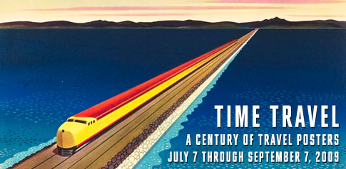
Time Travel
July 7 - September 7, 2009
International Poster Gallery proudly announces its 16th Annual Summer Poster Show featuring a spectacular collection of original vintage travel posters from the last 100 years.
Travel has been one of the most popular and widespread poster categories since the medium's birth in the late 19th Century. The exhibition focuses on the fascinating changes in travel and travel posters over four periods - the 1890s to WWI, the Twenties, the Thirties, and the Postwar era of the Fifties and Sixties. It traces the roots of the travel poster from the early days of train travel through the golden era of the ocean liner, zeppelin and jet plane. Selections are taken from International Poster's world-leading collection of more than 1200 travel posters.
The exhibition opens with a design by Hugo d'Alesi, the so-called "father of the travel poster." Most early travel posters were done in "The Information Style," with overloaded text, detailed train schedules and small inset pictures that created graphic confusion and little visual impact. D'Alesi's Tunisie poster from around 1892 includes one inset but is now dominated by a succinct headline and a coherent large graphic of a caravan heading into the desert. In his roughly 100 posters for the French railways, D'Alesi would lead the way to a more organized and elegant style that was dubbed "The Landscape Style."
In the Teens and early Twenties, the Landscape style of painterly illustrated posters would yield to Simplified Realism, a more graphic and modern approach with simplified details, clean typography and abstract areas of flat color. A fine example is Walter Thomas' towering Cunard to Boston, showing a steamer heading out to sea. Another leading practitioner of this style was Roger Broders, who created nearly 100 posters for the PLM railway. His poster of Florence - Chemin de Fer PLM, 1921, is one of the most beautiful nighttime travel images and surely the finest poster of the Renaissance city.
By the late Twenties, travel posters shifted dramatically to a new Machine Age style, led in Paris by the revolutionary A. M. Cassandre. Strongly influenced by modern art, Cassandre's Art Deco style shocked the public with its dynamic compositions, abstract geometry, new typographic styles, and tight interplay of word and image. Unlike his predecessors who portrayed travel destinations, Cassandre focused on the transportation marvels of the Roaring Twenties. His poster of the great French ocean liner Normandie uses the graphic language of Surrealism to create an imposing masterpiece. Everything from the flock of tiny birds to the upward sweeping vantage point is designed to accentuate the ocean liner's scale and stately character.
Cassandre's versatile and cerebral style was difficult to mimic, but its influence was enormous around the world. For example, his pioneering use of photomontage in travel posters was followed by a remarkable series by Herbert Matter for Swiss ski resorts. In many ways Matter's posters can be viewed as the climax of the artistic travel poster, with their surrealistic juxtapositions of scale and constructivist energy.
The outbreak of World War II brought the Golden Age of Travel abruptly to a close. After the war, travel was transformed by a huge worldwide fleet of new turboprops, with their ability to fly faster, farther and more reliably. All this opened up an era of mass transportation. Coach class became common as fares dropped sharply and for the first time tourists became as active as government and business travelers. By the early Sixties, with the advent of the Boeing 707 jet, almost anyone could afford to fly.
Travel posters were revitalized by this new demand. Air France continued to create classic, richly printed posters reminiscent of pre-war years, but the rapidly expanding American carriers brought out the best of Madison Avenue to create memorable brand images. Outstanding and well represented in the show are TWA posters by David Klein, United by Stan Galli, and Swissair by Herbert Leupin.
The primary shift was away from Art Deco towards a relaxed, playful style that emphasized wit and charm for "Everyman" destinations like San Francisco, Hawaii and Disneyland. For example, Klein's hip poster Las Vegas- Fly TWA (c. 1960) highlights the city's day and nighttime attractions. The poster is cleverly split in two, with Sin City's nocturnal delights - most notably gambling - on the left against poolside palms and cocktails on the right. The design converges in the middle, bisecting the figure of an elegant woman, dressed in a glittering evening gown and striped swimsuit respectively.
By the Seventies, most of the charm and glamour of travel posters was gone. Illustration was usually replaced by color photography. There were exceptions - in the 1970s, Bernard Villemot, who studied with Paul Colin in Paris, created a fine series for the French National Railroad. In the Eighties, the revival of the Simplon Orient Express led to a delightful poster series by Fix-Masseau. And most recently, United Airlines has created a fine series for cities around the world.
"Travel posters account for some of the most bold and iconographic designs in this medium," comments gallery owner, Jim Lapides. "These pieces evoke an irresistible curiosity and desire for adventure, and have been doing so for over 100 years. In our 15 years on Newbury Street, the gallery has become well-known for its strong collection of original travel posters."
View all travel posters

Italian Poster Masterpieces Revisited
May 15 - July 5, 2009
International Poster Gallery proudly celebrates its 15th anniversary on Newbury Street with a dazzling selection of posters from our world-leading collection of Italian masterpieces. We've assembled a line-up of rare and beautiful Italian posters advertising travel, opera, food and beverage, transportation, and propaganda.
In 1995, we premiered the first major gallery retrospective of vintage Italian posters in the U.S., "The Italian Poster Rediscovered." The exhibition helped to establish the lesser-known Italian poster in the ranks of the best poster art of France, Switzerland and Germany. Fifteen years later, we're once again celebrating the rare and increasingly popular Italian poster with this special anniversary exhibition.
The best-known Italian posters advertise one of Italy's most distinctive cultural institutions - the opera. Oversized, richly melodramatic and explosively colorful, the opera poster captures the very essence of the Italian spirit. The exhibition headliner, Sogno d'un Valzer, or "Dream Waltz" of 1910 by Leopoldo Metlicovitz was created to promote the operetta of the same name. It is known as one of the most romantic and passionate posters of all time, and is a classic example of Italian Art Nouveau. An officer and his lady dance a waltz while a violinist plays intently. The poignant message of "love lost" is clear when one realizes that the officer is but a specter fading into the poster's misty background.
The emotional intensity of Metlicovitz's poster and its deep, rich color is matched by Adolfo Hohenstein's 1899 Tosca, a 10-foot high tour de force that depicts the dramatic climax of Puccini's opera. Bathed in a sea of red blood and dark shadows, this poster perfectly echoes the passion and spectacle of the Italian opera.
Hohenstein, a German-born production designer, came to La Scala in the 1870s to design sets and costumes. As the director and artistic master of the Ricordi printing operation, Hohenstein saw a meteoric rise as the unlikely 'father of the Italian poster."
A lesser-known but spectacular opera poster features one of the most extraordinary lithographic color harmonies in the genre. Metlicovitz's oversized 1907 Giulio Marchetti, advertising a comic opera company, presents the iridescent jade-green of the subject's robes against a lush grape background.
This recently-acquired rarity was the first Italian masterpiece sold at the gallery 15 years ago, and this exhibition marks the first time it has appeared on the market since then.
The show also features a premier lineup of transportation posters - advertising ocean liners, automobiles and airlines. Highlighting this category is Giuseppe Riccobaldi's Fiat Rampa, 1928. Italy's leading automobile manufacturer, Fiat recruited the greatest names in Italian poster art to bring excitement to the brand.
Riccobaldi, who began his career as a stage designer, caused a sensation with this clean, sculptural design. Inspired by the spiral ramp leading to the test track on the roof of Fiat's massive Turin factory, this coveted masterpiece is a prime example of Italian Art Deco design.
The opening of several inter-alpine tunnels around the turn of the century made travel to Italy much easier, and stimulated beautiful designs for tourist destinations like Lakes Garda and Como, Amalfi, Sorrento, Florence, Rome and Siena. Perhaps most spectacular from this era is another uniquely colored Italian poster, created for the newly opened National Hotel in Cairo from 1905. Unsigned but most likely designed by Hohenstein's Neapolitan contemporary Mario Borgoni, it features an explorer mounted on a camel surrounded by a stunning sunset over the pyramids.
Italy has also produced some of the most beautiful fashion posters. Perhaps the most well-known is a series of posters for the Neapolitan department store E. and A. Mele, which commissioned about 185 large format poster designs between 1900 and 1914. Marcello Dudovich, often considered the greatest fashion poster artist of all time, created no fewer than 14 designs for Mele.
One of the most elegant dates from around 1910 and portrays a nattily-clad equestrian posing his pug for two admiring friends at the stables. Mele was instrumental in promoting aristocratic lifestyles and fashion to the rising middle class in Italy.
Due to the sheer scale of Italian poster art and the depth of International Poster Gallery's holdings, featured exhibition pieces will be rotated continuously. Returning visitors are rewarded with newly featured posters on a weekly, and sometimes daily basis, while specific works in the gallery's extensive collection are available for viewing on request.
View all Italian posters

Ice Breakers
February 2 - March 20, 2009
Keep warm with our playful exhibition featuring a sizzling selection of posters hot and cold -- winter sports, tropical destinations, spirits and other products to celebrate the season!
Frederic Rouge, Diablerets Aperitif Sain, c. 1920
This spectacular and rare poster attributed to Frederic Rouge advertises an aperitif from its namesake village and peak in the Swiss Alps where its herbal ingredients are found. Located near Gstaad, Diablerets, or "Devil" in English, is now a leading ski area and is pictured in the background. This example is beautifully printed and in fine condition, with wonderfully evocative lettering. It's one of more than 250 winter sports posters in stock. Now that's the way to enjoy the winter!
Niklaus Stoecklin, Meta Meta, 1941
'Tis the season for fondue, and Meta's cooking briquets will get it piping hot. Stoecklin's Meta Meta is one of the most celebrated posters of the Object Poster Style that dominated Swiss product advertising from the '20s through the '50s. Of the many posters done in this super-realist style, none surpasses the subtle highlights and rich surfaces in Stoecklin's still-lifes. This poster won a Swiss poster of the Year Award in the competition's inaugural year, 1941.
Mario Borgoni, Cairo Egypt, c. 1910
"A trip to Egypt," wrote Alexis Gregory in the Golden Age of Travel, "was the most exciting of all the winter activities available to the rich at the turn of the century... They found in Cairo the world of a thousand and one nights, bazaars filled with precious carpets, jewelry, and sweet spices, streets abounding with processions of dervishes, veiled ladies and gentlemen in bright red fezzes. In the nearby desert they were dazzled by the pyramids of Giza and Memphis."
Borgoni's bold poster captured the timeless appeal of Egypt, promoting two of its most famous destinations, Wagon Lits' Shepheard's Hotel and Ghezireh Palace. Shepheard's opened in 1841 as a home away from home for Europeans in the Middle East and underwent several expansions between 1891 to 1925. The Ghezireh Palace was built in 1869 to house visiting monarchs, later becoming a Wagon Lits property in 1894.
The art director of Naples' famed Richter printing operation, Borgoni was, along with Adolfo Hohenstein and Leopoldo Metlicovitz, the leading Italian posterist of his generation. This rare poster is in fine condition with spectacular, rich color.
A. Knab, Riviera-Dienst - Hamburg America, c. 1910
The Hamburg-America Line (HAPAG) commissioned many of the most unusual and handsome destination posters for its world-wide routes. Founded in 1847, the company's growth was fueled by German immigration to the U.S., solidifying its status as one of the largest shipping operations in the world.
Led in the early 20th century by the innovative Albert Bailin, HAPAG created the first dedicated cruise ship, beginning with winter cruises to the Mediterranean.
This beautiful Modernist travel poster would have made a strong impression on the winter streets of Berlin and Munich, tempting the passerby with the promise of sun and lush vegetation in the booming winter resorts of the Riviera. Ah, the Golden Age of Travel!
Artist Unknown, Chocolat Klaus Delecta, c. 1900
Chocolate has perennially been one of the hottest poster categories. Many classics were produced during the Belle Epoque, often featuring children (surprisingly, few masterpieces were produced after WWI with the advent of the chocolate bar). This in-store display for a famous brand is an irresistably charming example. It is the first time we have seen this design.
Lance Wyman, Mexico Olympics '68, 1968
In his book "A History of Graphic Design," Philip Meggs coined this rare poster for the 1968 Mexico Olympics "one of the most successful in the evolution of visual identification..." Its design was dually inspired by the the native art of the Huichol and the Op Art style of the Sixties. The result achieves a fusion of the area's rich native culture with the kaleidoscopic and exciting reality of contemporary Mexico.
Wyman studied at the Pratt Institute and was inspired to specialize in logo design after coming into contact with the work of Paul Rand. One of our favorites!
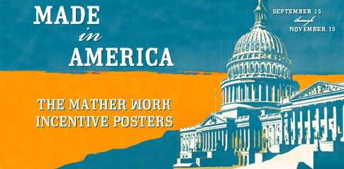
Made in America
September 15 - November 15, 2008
International Poster Gallery is proud to present Made in America: The Mather Work Incentive Posters, an exhibition of striking and unique American posters from the Roaring Twenties. Printed in Chicago between 1923 and 1929, the color lithographic posters were designed to improve worker productivity and curb turnover during a time of economic expansion and plentiful jobs. The traditional American virtues the posters promote are as relevant today as they were 80 years ago and represent a unique chapter in American advertising and economic history.
While these original vintage posters can be seen as workplace propaganda or camp Americana, they are perhaps most interestingly viewed as a visual expression of the idealism and optimism of the rising nation. President Calvin Coolidge pithily summed up in two sentences the ideology of the era in his 1925 speech to the Society of American Newspaper Editors: "The chief business of the American people is business...The chief ideal of the American people is idealism."
This attitude sparked a movement known as Welfare Capitalism, in which employers voluntarily offered incentives such as reduced hours, higher wages, health insurance, and paid vacations in return for greater productivity and worker loyalty, while blunting the arguments of labor unions and socialists.
Seth Seiders, a Chicago-based entrepreneur, saw opportunity in the movement and started selling factory owners subscriptions to his poster series. The annual "campaigns" found ready acceptance in a workplace accustomed to Madison Avenue advertising techniques in government production posters recently seen during World War I. Mather's series however, was the first widespread employer sponsored program with the goal of corporate success and employee development.
Outstanding American artists such as Willard Frederic Elmes and Hal Depuy were commissioned to boldly employ familiar images such as racing trains, running football players, and mischievous clowns alongside simple and direct headlines. Many of Mather's artists were heavily influenced by the "Plakatstil," or Poster Style, made famous in Germany by Lucian Bernhard and Ludwig Hohlwein. The clean lines of the 1929 Mather posters in turn anticipated the streamlined and dynamic Art Deco designs that would dominate the next decade.
Artist Frank Beatty's "The Perfect Finish" (1929) depicts a sailing crew hard at work during a boat race. The subtitle, a classic example from Mather's lexicon, warns, "No job's done till it's ALL done," succinctly communicating through word and image the need for teamwork to beat the competition.
Also featured is Hal Depuy's poster featuring bold imagery from America's favorite pastime, baseball. "Over the Plate!" (1929) depicts a pitcher in mid-throw and states, "Winners never have to say they're good - their work proves it. RESULTS TALK." The baseball metaphor plays directly to the American worker, who knew the difference between a pitcher who throws balls or strikes.
Employers changed the posters weekly based on current events, holidays or factory problems. A catalog organized the posters by theme, with cautionary categories ranging from laziness, responsibility, mistakes, and rumors to fire prevention and even practical joking. With their fresh graphics, surprising metaphors and over-the-top but thought-provoking platitudes, the posters demanded attention.
Mather created approximately 350 different images in seven annual campaigns before the series ended abruptly with the stock market crash in October of 1929. By January 1930, jobs were increasingly hard to find, and employers did not have the funds or the need to motivate workers as they had in the Twenties.
"Our exhibition of Mather's posters is timely as we reexamine our national values in this election year," comments gallery owner Jim Lapides. "Even today we are struck by their graphic beauty, old fashioned American imagery and homespun wisdom. Although they reflect on an era with different challenges, their message of idealism and working smart is both refreshing and inspiring."
View All Mather Posters
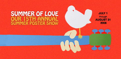
Summer of Love
July 1 - August 31, 2008
We proudly present "Summer of Love," the gallery's 15th annual summer poster show, running July 1 through August 31, 2008. Celebrating the pleasures of summer, the exhibition features more than 40 posters for travel, expositions, entertainment and more.
SOME HIGHLIGHTS:
Arnold Skolnick, 3 Days of Peace & Love - Woodstock, 1969
This poster played an essential role in the success of the largest rock concert of the Sixties, an event that was as famous for its freedom from violence as it was for its remarkable musical line-up. It perfectly expressed in one symbol - a dove on a guitar - what Woodstock was about. Despite the need for lengthy text, the poster was as graphically succinct as any poster by Cappiello.
Our Woodstock poster is one of several mementos of the "Psychedelic Sixties" in the show; others include a remarkable Through the Looking Glass LSD blotter and Victor Moscoso's Neon Rose poster starring the Chambers Brothers.
Nembhard N. Culin, In 1939 - The New York World's Fair, 1937
Nembhard N. Culin, an architect working on the World's Fair project was asked to create an advance poster for the event. His shimmering Art Deco image of the Trylon and Perisphere captured the stunning majesty of the Fair before it even existed. The stunning bird's-eye view of the ramp to the "World of Tomorrow" inspired a sense of anticipation much like monuments to earlier fairs such as the Eiffel Tower (Paris, 1889) or the White City and the Ferris Wheel (Chicago, 1893).
Culin's design is just one highlight from our collection of world's fair and exposition posters. We also include images from the San Francisco World's Fair of 1939, the Chicago Fair of 1933/34, the 1937 Paris Exposition Internationale and others.
Mitchell, New Zealand Fiords, circa 1936
Few travel posters are more evocative than this extremely rare and beautiful pre-WWII image from New Zealand. What could be better than cooking over a campfire while watching the sun slowly set on the majestic peaks of Milford Sound? Oh, to be alive!
Other featured travel destinations are Fez, Kilimanjaro, Skagen (Denmark), Iguazu Falls, Venice, Lake Como, Stockholm and Mont Saint-Michel. Take a tour!
Leupin, Eptinger Acqua Minerale, 1958
"Fresh as a summer day" is a perfect way to describe this Swiss Poster of the Year Award winner by Herbert Leupin. It is one of more than 30 designs that the endlessly creative Leupin invented for Eptinger, the leading Swiss mineral water. With rich color and its casual style, it is an ideal poster for a beach or country house setting.
Villemot, Plages de France, 1955
Bernard Villemot studied with Art Deco master Paul Colin in Paris. For the better part of four decades he carried on his spirit of elegance, rich color and abstraction. Villemot also proved to be exceedingly creative, producing long-lived campaigns for Bally, Orangina, Perrier as well as a number of French travel destinations. This is one of his most impressive travel posters.
Muggiani, Martini Vermouth, 1921
Fireworks are on our mind as we approach July 4th. In this electrifying image, a figure is propelled, much like a roman candle, by a bottle of Martini Vermouth. It is a wild and fantastic image, revealing Muggiani's knowledge of Italian Futurist painters and their love of modern technology, its dynamism and its power. Muggiani created about 50 posters and this is surely his masterpiece. It is the only example of its size (approximately 40" x 55") we have encountered in 20 years. Muggiani's tour de force is one of several food and beverage posters that conclude the show.

A Century of Modernist Posters
April 15 - June 23, 2008
International Poster Gallery is proud to announce A Century of Modernist Posters, an exhibition of outstanding selections from the gallery's extensive holdings of Modernist twentieth-century graphic design. It traces the rapid development after 1900 of Modernism which blossomed over the course of the century into a wide variety of styles.
The new century, like those preceding it, brought a fresh examination of stylistic possibilities. In France, Art Nouveau's floral excesses gave way to the brilliant metaphors of Cappiello which used a psychological approach to creating brand identities. In Scotland's Glasgow School and Austria's Vienna Secession, and later in Germany and England, Art Nouveau yielded to flat shapes and geometrical designs. A fine example of this simplified and functional approach is Wilhelm Dachauer's Secession poster of 1919.
Such early modernist efforts would serve as the foundation for the German Plakatstil, or Poster Style, led by Lucian Bernhard in pre-World War I Berlin and in Munich by Ludwig Hohlwein. Bernhard created the first Object Poster, consisting solely of a product and brand name. Using only flat colors and shapes, Bernhard's work marked the next stage in creating an abstract - and modern - visual language. Our cover poster by Danish artist Sven Henrikksen for a gas exhibition is one of several included examples of work by Bernhard and his contemporaries.
After World War I, graphic design would be revolutionized by the Machine Age and the modern art movements that arose in response to it, primarily Cubism and its offshoots (Futurism, Vorticism and Suprematism), Dada, Expressionism, and Surrealism. The show contains the Stenberg Brothers' aggressive Constructivist design of 1926 for a magazine and the Bauhaus-inspired design by Stoecklin for a Swiss City Planning exhibit in 1928.
Ultimately, the Machine Age vocabulary of speed, power and precision would coalesce in a new international decorative movement called Art Deco. Shaped by a wide variety of graphic influences, forms became abstract and streamlined, and poster artists truly became poster designers. In Paris, A.M. Cassandre's posters of speeding trains and towering ocean liners would become icons of the period. The exhibition includes several Art Deco masterpieces by Colin, Morach, Seneca, Loupot and Cassandre, including his highly abstract Heemaf, for a Dutch power supplier.
After World War II, the poster declined in many countries as magazines and television became potent competitors. In Switzerland, however, the poster continued to evolve with the development of a new graphic style with roots in the Bauhaus. Known as the International Typographic Style, or Swiss Style, it relied on typographic elements in black and white. Perfected at design schools in Zurich and Basel, the style was based on a mathematical grid, with strict graphic rules and stark photography, all to provide a clear and logical structure. Becoming the leading graphic design style worldwide in the '70s, it continues to exert a strong influence today.
The show includes several mid-century Modernist pieces by Hofmann, Muller-Brockmann and others. It then concludes with several Post Modern designs from the Eighties and Nineties, which break the strict rules of the Swiss Style. Notable are the Swiss works of Weingart, Schraivogel, Troxler and Tissi, and the American designs of Milton Glaser and British-born Peter Gee.

Baby Boom
September 19 - November 18, 2007
International Poster Gallery is excited to present a fascinating retrospective exhibition of over 50 consumer advertising posters from the postwar Baby Boom era, at the gallery through November 18.
More than a half-century ago, the Fifties ushered in an era of peace and prosperity throughout much of the world despite the rising tensions of the Cold War. Populations exploded across the globe, especially in the U.S., Europe and Australia. In 1954, the birth rate in the United States climbed above 4 million and sustained that rate until 1964, when more than 40% of the population was under 20 years of age.
The Baby Boom had a profound impact on society, modern culture and advertising methods fueling the birth of international consumer brands. The era ushered in a brightly colored and whimsical style that became the dominant look of consumer advertising.
In the late 1940s and early 1950s, Swiss artist Herbert Leupin was pioneering a more playful, child-like style. Leupin's first poster for Coca Cola in 1953 features a simply drawn music stand, from which a "pause" sign hangs.
This unique style would proliferate in posters for products as diverse as cameras and film (Brun, Film Gevaert, 1950), cigarettes and cigars (Leupin, Rossli, 1953), margarine (Savignac, Margarina Gradina, 1953), and cars (Anonymous, Fiat 500, 1957).
World travel was now within the reach of the masses, and an explosion of delightful new ad campaigns appeared from TWA, BOAC, and Air France among others. One of the finest posters of its kind was David Klein's 1955 New York - Fly TWA, a dazzling abstract view of Times Square.
Teenagers bobbed to transistor radios and televisions became a fixture in living rooms. An elegant Philips poster by Eric from 1961 featuring streamlined clock radios and a woman's hand highlights this category of the exhibition. Other posters by Villemot, Pintori and Garretto advertise revolutionary advances in refrigerators, office machines and motorbikes.
Our Baby Boom exhibition wouldn't be complete without two major icons of the period - Audrey Hepburn and James Bond. Hepburn's visage spilled over into fine advertising posters like Rene Gruau's 1957 Relax... for a French ocean liner. The irrepressible James Bond wields his signature pistol and sly expression in a rare 1964 poster for the film From Russia with Love.
The Baby Boom era's peace and prosperity created a veritable "poster boom". Many of these posters are now more than 50 years old, some are rare or already hard to find, and several are recognized icons of the period. Don't miss this great look back!
View the Exhibition
View more 1950's and 1960's posters here!
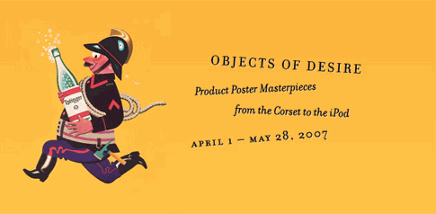
Objects of Desire
April 1 - May 28, 2007
A seemingly simple task of the poster since its blossoming in the late 19th century was to sell products of all sorts, from the mundane and prosaic like toothpaste, to the luxurious and exotic like absinthe, to the complex and technical like the bicycle and the iPod. Yet no task confronting the poster designer has proven to be more challenging, or more difficult to repeat successfully. Objects of Desire traces the history of the product poster, focusing on the styles, artists, and masterpieces of the genre over the decades.
Belle Epoque Product Posters
The show begins with Jules Cheret, the father of the poster, who featured the first lesson of product posters: sex sells. Most of his product posters, like Job Cigarettes and Pastilles Geraudel cough drops feature his patented "Cherette", a beautiful damsel displaying a product with various props like cats, umbrellas or merely attitude.
The era's second approach to the product poster involved humor. This perennial method is aptly illustrated by Alfred Choubrac's delightful Corsets Baleinine Incassables (1900) which reveals that the product augments every figure from full to svelte, and every personality from brassy to demure. In addition, the rise of the Art Nouveau style led many artists to turn to symbolism to sell products. Fine examples are Adolfo Hohenstein's Fiammiferi senza Fosforo, which recreates Heaven and Hell to sell sulphur-free matches, and Alphonse Mucha's beautiful vision of Ceres, the goddess of agriculture, to sell Lu biscuits.
20th Century Product Posters
Romantic techniques yielded in the new century to two new approaches more in tune with changes in business and society. In Germany, Lucian Bernhard developed the Object Poster in 1905, which featured a realistic depiction of the product with its name above it and little else. With flat colors and simplified shapes it was the beginning of a modern, direct and utterly Teutonic approach to selling products.
At the same time, Leonetto Cappiello created a new approach that would sweep France. Cappiello stated that "surprise was the essence of advertising", and proved it by creating caricatures and ingenious metaphors that would endure for decades. Cappiello's humor-based, subjective approach would influence countless artists including Achille Mauzan and even the Art Deco master, A.M. Cassandre, whose Dubonnet man became the most famous of all advertising characters.
Meanwhile, Bernhard's approach reverberated in Switzerland, where Otto Baumberger invented a hyper-realistic type of Object Poster. So finely drawn and printed, his 1923 PKZ Coat was mistaken for a photograph. Using the coat's label to eliminate text, it seemed utterly unemotional and clear. A few years later, the surrealist painter Niklaus Stoecklin of Basel turned to the Object Poster, creating his 1925 image for Cluser transmissions which floats like a machine age icon in space. The French and German approaches began to merge in the late Thirties with the arrival of Herbert Leupin in Basel, whose marketing imagination reinvigorated the Object Poster. Now, a bent traffic sign replaced a water bottle in Leupin's poster, which urges the viewer to "Drink Eptinger mineral water instead!"
Post World War II Product Posters
The product poster changed dramatically after the war, due to new printing techniques and the rise of consumerism. With the switch to offset lithography and the advent of large format photography, Object Posters lost their impact. A shift towards humor and visual puns was occurring worldwide. In Switzerland, Herbert Leupin and Donald Brun created a more relaxed, cartoonish style which often used anthropomorphic animals and animated objects to represent their brands. In France, Raymond Savignac created more than 600 posters, including an ingenious poster for Parisiennes cigarettes featuring a gendarme with a giant cigarette serving as a traffic signal. In the U.S., Paul Rand created a delightful series for El Producto which established his reputation in product advertising.
By the late Fifties, product posters declined due to the increasing use of the mass media. Notable exceptions are the beautiful posters by Art Deco stylist Bernard Villemot for Bally in the '70s and '80s, the sexy H & M series in the Nineties and the iPod poster campaign which blankets billboards worldwide today. The latter, featuring neon color and hipsters dancing to their iPods, beckons the viewer to become equally free and hip by picking up their own iPod. The product poster lives on!
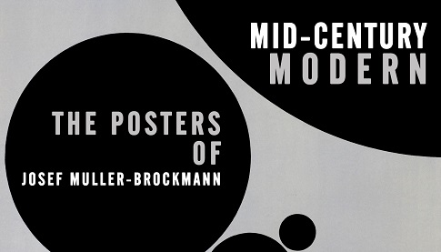
Mid-Century Modern
September 27 - November 15, 2006
International Poster Gallery announces Mid-Century Modern: The Posters of Josef Muller-Brockmann an exhibition celebrating a newly acquired collection of the artist's groundbreaking International Typographic Style posters from the 1950s and 1960s. The exhibition is the gallery's second on Mid-Century modernism, following up last year's show on the work of Armin Hofmann. Despite vastly different methods, both men helped create the "Swiss Style" which became the leading graphic approach worldwide that continues to exert its influence today.
Masterpieces of Graphic Design
September 15 - November 30, 2005
More than a century of graphic design innovation is on display this Fall, as seen through 50 poster classics that trace the medium's changing form from its birth in the Belle Epoque to Post-Modern poster experiments around the world today.
The color lithographic poster appeared around 1870 when the art world was struggling to adapt to the forces of industrialization. Large, full color posters for the first time could be mass produced, and artists searched for effective and "modern" ways to use the new medium. Over the decades, poster design evolved from a disorganized and complex jumble of text and illustration to a refined and universal language of design.
The exhibition begins fittingly with such masterpieces as Jules Cheret's remarkable Folies Bergere Loie Fuller (1893), which both looks back to the Rococo for inspiration and anticipates Art Nouveau in its flowing lines and sinuous patterns. Toulouse-Lautrec elevated the poster to a fine art form with posters such as Revue Blanche of 1897, influenced by Japanese woodblock prints. An array of Art Nouveau masterpieces is offered from TA Steinlen and Giovanni Mataloni to a rare, highly abstract work by Dutch artist J. Thorn Prikker, pictured at top.
After 1900, the avant-garde scene shifted to Germany, where a spare style that stripped a design of everything except the object and its brand name developed. An "Object Poster" for the men's store IF Reiser (c. 1910), is a fine example of the Berlin approach, which was diametrically opposed to the organic profusion of Art Nouveau. At the same time, Ludwig Hohlwein developed a powerful but more decorative approach in Munich, as seen in his 1912 Flugmaschinen - Werke.
The 1920s and 1930s were marked by the flowering of the many "isms" of Modern Art, such as Fauvism, Cubism and Constructivism, all of which strongly influenced poster design. On view are stunning examples of early Soviet film posters by masters such as the Stenberg Brothers. The preeminent figure of this era was A.M. Cassandre, whose sleek designs of towering ships and speeding trains are considered 20th Century icons. He assimilated his knowledge of avant-garde movements into a popular style often called the Machine Age Style, or Art Deco, which is widely represented in the show.
In addition, pioneering commercial use of photomontage is seen in Herbert Matter's All Roads Lead to Switzerland (1935) and Francis Bernard's elegant Arts Menagers of 1933. Switzerland's fascination with the Object Poster from the 1920s to the 1940s is well represented by posters of everyday items hyper-realistically blown up into modern icons.
After World War II the show focuses on the mid-century modern movement known as the International Typographic Style. Through its use of sans-serif type, an orderly design grid and emphasis on photography, the poster became a truly graphic medium.
The radical poster styles of the 1960s also appear: Vermine Fasciste, a poster for the student uprisings in Paris of 1968 and Richard Avedon's solarized portraits of the Beatles (1967) capture the era. A final chapter is devoted to Post Modernism, a term used to describe styles from the 1970s to today, reacting to the Swiss Style which dominated the world for two decades. Today's graphic design masters on view include Gunther Rambow, Lex Drewinski, Ikko Tanaka, Ralph Schraivogel and others.
Summer Games
June 29 - September 5, 2005
Sport posters are featured in our 12th Annual Summer Poster Show, with a century of more than 100 original lithographs in all styles and price ranges. You'll find bicycling posters, tennis posters, boat and horse racing posters, Olympics posters, golf posters and much more!
Sports Poster History
Interestingly, spectator sports and the lithographic poster grew up together. Both were in their infancy in the 1890s, when Jules Cheret perfected the ?four stone" color lithographic process and sparked the poster craze of the Belle Epoque. Fittingly, the show opens with early examples both populist and upper crust: three wonderful baseball posters dating from 1905 by America's premier lithographer, Strobridge Litho of Cincinnati, and a day at the races in Italy featuring a beautiful woman in Sunday finery beneath a parasol.
The 1890s also ushered in the rise of participant sports, such as bicycling, which became the rage on both sides of the Atlantic. The bicycle was a major change agent, as it liberated women from the home, required their physical fitness, and impacted the way they dressed. The show features Thor's Peugeot Bicycles (c. 1900) poster and one of only two bicycle posters by Cheret, Cleveland Cycles, of 1901, both fine examples of the sport poster category.
Sports posters were also an important element of the rise in popularity of new kinds of sports at the turn of the century. New technology was essential to the rise of motor racing and aerial shows. Both captivated the public from the minute they appeared on the scene. The Automobile Club of France sponsored the first auto grand prix in 1906, and the show spotlights a rare classic from the 1912 Grand Prix at Le Mans. Aerial meets became powerful draws by the summer of 1909, a mere five years after the Wright Brother's first flight. The first international flying show, held at Reims, drew more than 100,000 spectators. Several early aviation prints are presented in the show, as well as a previously unseen poster for the Mt. St. Michel Aviation competition in 1911, which apparently never took place.
By the 1920s sport had entered a golden era of popularity, due to increasing leisure time and disposable income, combined with the broad reach of radio. The poster had been transformed as well, with the streamlined Art Deco style of Cassandre sweeping away the more organic and detailed Art Nouveau style. Examples in the show are Merano, a fashionable horse racing poster from the Dolomite region in Italy, an in-store golf poster display for Semmering in the Austrian Alps, two world championship boat race images by Percival Pernet, and auto racing posters from Mercedes and the Swiss Grand Prix.
In the Twenties, even the sport of girl watching became more interesting, as sunbathing became popular. Several Roaring Twenties resort gems are displayed, such as Broders elegant Antibes (c. 1927), Roger's L'ete sur La Cote D'Azur and Augusto Giacometti's Grisons.
The show concludes with a selection of post-WWII sport posters. Amongst the best are a series for the French Tennis Open. The 1981 poster featuring a close-up of only the sweat band and long hair of Bjorn Borg's head qualifies as a classic sports poster. There are also several posters included from various post-war Olympiads. Starting in 1896, the modern Games have a rich poster tradition that continues to this day.
"This is our first show dedicated to the world of summer sport posters and reveals an incredible range of subject and style," Gallery owner Jim Lapides stated. "We are pleased that there is something for everyone here, both collectors and newcomers, with prices starting below $100 to several thousand."
View All Sports Posters
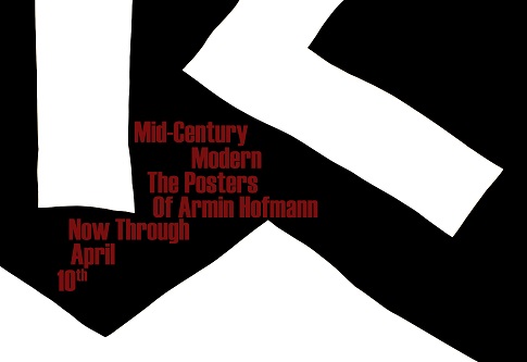
Mid-Century Modern
February 25 - April 10, 2005
Working in the early 1950s, Hofmann was a pioneer of the "Swiss Style" that became the leading graphic approach worldwide over the next two decades, and continues to exert its influence today. This exhibition celebrates a newly acquired collection of the artist's ground-breaking International Typographic Style posters. The recent acquisition includes nearly all of Hofmann's masterpieces.
Hofmann's posters express a graphic purity rarely seen in any medium. Restricting his palette to primarily black and white (and sometimes a third color), Hofmann used a mathematical grid to provide a unified and orderly structure. Hand illustration disappeared, replaced by black and white studio photography, while traditional typefaces were replaced by clean and straightforward sans serif styles.
In less capable hands, this severity might lead to uninspired and emotionless efforts. But through his artistic inspiration and skill, Hofmann accentuated the contrasts and tensions between design elements to create bold statements, full of surprise and subtlety, which read powerfully from both close-up and at a distance.
His 1959 poster for the ballet Giselle, for example, is a sublime juxtaposition of a soft, ephemeral photographic image with hard-edged, geometric and immovable typography. So carefully balanced is the composition that the entire poster pivots graphically on the dot on the letter 'i' in the title.
In addition, this new style was perfectly suited to the increasingly global postwar marketplace: corporations needed international identification, and global events such as the Olympics called for a universal graphic vocabulary which the Typographic Style provided. Hofmann's Basel design school established a link with the Yale School of Design, which became the leading American center for the new style. By the 1970s, use of the International Typographic Style had spread throughout the world.
While collected by art and design museums throughout the world, Hofmann's posters remain surprisingly affordable - with prices starting at just a few hundred dollars.
View all Mid-Century Modern posters here
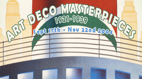
Art Deco Masterpieces
September 17 - November 22, 2004
We are proud to announce "Art Deco Poster Masterpieces," an important retrospective exhibition and sale of over 50 works from 1921 to 1939. The exhibit runs concurrently with the highly acclaimed Art Deco exhibition at the Museum of Fine Arts Boston.
After World War I, the curvaceous opulence of Art Nouveau was soon replaced with the desire for a streamlined aesthetic celebrating modernity and efficiency. Art Deco, also known as the "Machine Age Style," captured the speed, energy, and elegance of the exciting new era and remained the primary international decorative movement until World War II.
Art Deco's design influences span a diverse array of styles and eras. Borrowing from bold avant-garde art movements such as Cubism, Futurism, and Constructivism, Art Deco was able to achieve a sense of power and dynamism. At the same time, the style hearkened back to the mathematical, geometric design themes prevalent in ancient Egypt, Assyria, and Persia. Art Deco also took cues from the German Plakatstil, the Viennese Secession, the Deutscher Werkbund, and the Parisian fashion design revolution, resulting in a simplified, streamlined, and angular style.
The 1925 Parisian Exposition des Arts Decoratifs - the exposition responsible for Art Deco's name - marked a turning point for the style. Noted for its soft elegance and exoticism up until that point, Art Deco developed into a more muscular and forceful style by the late 1920s and into the '30s.
Charles Loupot was a leader in this transitional period of the Twenties which combined the flowing grace of Art Nouveau and the abstraction, geometry, and tone of the new styles. His remarkable poster for PKZ of 1921 is a fiery scene of intense pastel tones for a men's fall clothing line. Another masterpiece comes from Ludwig Hohlwein, the great modernist from Munich, whose Herkules Bier poster (c. 1925) shows a muscular torso in flat tones of pink and beige that ripples with mystery and menace.
The preeminent figure in the latter phase of Art Deco was A.M. Cassandre, whose sleek poster designs of towering ships and speeding trains are considered 20th Century icons. Among his exhibited works are the Statendam (1929), one of his first ocean liner posters, revealing the artist's interest in Purism, and a rare variant of the Normandie (1935), a surrealistic tour-de-force that is perhaps the most famous poster of all time. Cassandre's rare Triplex poster (1931) features the somewhat robotic Everyman typical of the Thirties who is protected by unbreakable auto glass - all conveyed in a graphic shorthand which illustrates Cassandre's axiom that a poster should communicate like a telegram.
Cassandre's influence was widespread not only in France but abroad - so much so that even the Museum of Modern Art in New York recognized Cassandre's preeminence in a one man show in 1936. His disciples included Munetsugu Satomi, a Japanese working in Paris, Herbert Matter of Switzerland, and Pierre Fix-Masseau of France, who are all represented in the show.
The international nature of Art Deco is strongly reflected in the exhibition. Italy is represented by Ugo de Lazzaro's Italian Aerial Lines poster and Giuseppe Riccobaldi's Fiat 1500 poster, both showing the influence of the Futurist movement in their use of lines of force and airbrushing. Willem Ten Broek shows the impact of Cassandre on the Dutch in his beautiful Holland-Amerika Lijn, and Henri Pieck's Utrecht Trade Fair posters reveal an understanding of Constructivism. Travel posters by Jupp Wiertz and Albert Fuss for German oceanliners and tourist bureaus share the vocabulary and symbolism that effectively evoked the modern world.
Dominant themes of the show include travel posters, a genre that was practically reinvented by Cassandre's explorations in the late Twenties. His posters shifted the focus from the destination to the excitement of travel itself. Theodoro's dynamic Chemins de fer de l'est echoes this approach, although top ranked artists such as Roger Broders and Charles Hallo, known as Alo, created Art Deco classics that were more traditional in their subject.
Another dominant theme is fashion, whose illustrators played a seminal role in the transition from Art Nouveau to the new style. Many fine examples of hand-colored plates for the Gazette du Bon Ton from Lepape, Barbier, Marty, Iribe, and Brunelleschi are included. The show contains a fine selection of posters for the Swiss men's clothier, PKZ, which commissioned several dozen Art Deco designs that were printed as beautifully as they were designed.
The exhibition is rounded out with posters from around the world which effectively feature many of Art Deco's key symbols - the oceanliner, the skyscraper, the plane and zeppelin, the auto, and the bridge. Purvis' commanding Australia's 150th Anniversary Celebrations (1938) and Joseph Binder's 1939 New York World's Fair represent the style's grand phase before WWII set in.
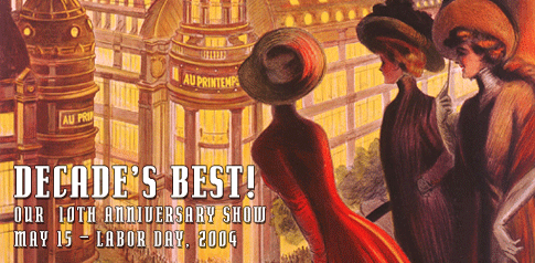
Decade's Best
May 15 - Labor Day, 2004
We are proud to announce the celebration of our 10th Anniversary with an exhibition of "Poster Bests" from each decade since the art form's first flowering in the Belle Epoque. The exhibition opens with classic posters from the decade of the 1890s, which is often called the Golden Age of the Poster. Along with timeless images from Steinlen, Mucha, and Toulouse-Lautrec, there are travel posters by Hugo D'Alesi and numerous miniature plates from the Maitres de l'Affiche.
One of the show's highlights represents the first decade of the new century. A previously unknown and undocumented image, Cappiello's poster for Printemps Department Store, is perhaps the most beautiful Parisian scene in poster art. With the magnificent galleries aglow on a cloudless summer night, three elegant ladies look down upon the crowd-filled boulevards from a nearby balcony. The poster reveals Cappiello at his most elegant, in the manner of his grand posters for the Mele Department Store of 1901 to 1904.
Another highlight of the show, which harks back to the Gallery's early exhibitions of Italian posters, is Giuseppe Riccobaldi's 1935 moonlit poster for Fiat's new model 1500. Here a streamlined red car streaks down the Appian Way in a Futurist-inspired blur. Perhaps more than any other poster, it unites the glory of the Roman past with the promise of a brilliant technological future.
The post-war section of the show is dominated by the contributions of the Swiss, who became the world leaders in graphic design. The Forties are amply represented by several Swiss Object Posters, including the 1941 Swiss Poster of the Year award-winning Bi-Oro from Niklaus Stoecklin. This style, with its hyper-realistic focus on the product, created stunning visual effects and was a fitting end to the lithographic poster, which was phased out primarily due to its high cost.
The Fifties are dominated by the relaxed humor of Herbert Leupin in Switzerland, Raymond Savignac in France, and Paul Rand in the U.S., and several of their posters are included. The International Typographic Style, created by the Swiss in the Fifties but dominant for decades, is represented by Armin Hofmann and Josef Mueller-Brockmann, its two primary masters. The show concludes with several selections from the Sixties to today from Milton Glaser, David Klein, Wolfgang Weingart, Rosemarie Tissi, and Ralph Schraivogel.
Since its opening, International Poster Gallery has gained a reputation for its world-class collection of original vintage posters. Owner James Lapides has written extensively on posters and is widely recognized as an expert in the field. "The last ten years have been incredibly enjoyable for me personally," Lapides comments. "We have drawn many new collectors to the poster field and added to the wealth of information available on posters and graphic design. We have been particularly pleased with exhibitions produced in cooperation with the Massachusetts College of Art, the French Library in Boston, and our work with other educational organizations and museums."
G'Day Mate!
March 10 - April 30, 2004
Vintage travel posters are featured in this visual tour of the world's most exotic destinations, which includes more than 100 original rarities from Australia, New Zealand Africa, Bali, the Arctic Circle, Soviet Union, and more from every continent.
Travel posters are the most popular area of poster collecting, and "G'Day Mate!" delivers with exotic and unusual posters from near and far. Most date from the Twenties and Thirties, when intercontinental travel became more safe, comfortable, and speedy. Tourism was a natural outgrowth of the needs of the great European empires to stay connected with their colonies; mail delivery and commerce lead to the development of better transport and exploration of frontiers.
The show includes several poster route maps for KLM, Air France and, Imperial Airways, which graphically reveal the proliferation of empire-oriented routes from Europe to every continent by the Thirties. For example, the Amsterdam to Dutch East Indies route was a 14 Day trip by KLM in the Twenties; by 1931 the route became weekly.
The core of the show is a rarely seen group of travel posters from Australia and New Zealand. With the advent of long range Flying Clippers in the mid-Thirties, it became much more feasible for tourists to reach the region. In Australia, the newly formed Australian National Travel Association (ANTA) ushered in a golden age of advertising, hiring world class artists such as Percy Trompf, Gert Selheim, and James Northfield to reveal the huge continent's splendors. The advertising focused on the uniqueness of Australia; its flowers, animals, native culture and natural wonders. Trompf's classic Great Barrier Coral Reef of 1933 cleverly depicts a serene boat scene above water while displaying a dazzling technicolor world below it teeming with life. Another classic by Tom Purvis, the leading British posterist, beckons the viewer to Sydney Harbor for the nation's 150th Anniversary in 1938 (see top of page). The show has four fine and exceedingly rare travel posters for Tasmania, which is advertised as the "Switzerland of the South."
A similar approach was taken in New Zealand, where the natural wonders of Milford Sound and Mt. Cook were touted in travel posters created for the New Zealand travel board in the Thirties.
The exotic theme of this show continues with several early transportation posters. Included are several first-rank posters by Albert Fuss and Otto Anton for the Hamburg Lloyd shipping company displaying its routes to Norway's Arctic Circle and Egypt. The show also contains more than a dozen transportation posters for the Southern and Northern Pacific Railroads that feature the newly created National Parks and other tourist highlights. In the early Twenties, The American West, hardly considered exotic today, was a vast frontier unknown even to most Americans.
The exhibition concludes with a smorgasbord of travel posters from Ceylon, India, Russia, Poland, Bali, Egypt, as well as several famous transportation posters for Cunard, Pan Am, and Imperial Airways.
View all Travel Posters
View all Transportation Posters

Timeless Beauties 1890-1939
November 23, 2002 - January 31, 2003
The Ninth Annual Holiday Poster Show features such rare and outstanding Art Nouveau examples as Toulouse Lautrec's "Troupe de Mlle. Eglantine" (1896) and "Moet et Chandon" (1899), a pair of elegant panels by Alphonse Mucha featuring Byzantine-clad beauties. The posters provide a remarkable contrast between the two artists, Lautrec's bawdy view of the world as seen through a dance hall, and Mucha's reverential portraits.
The innovations of both artists were made possible by Jules Cheret, who in the 1880s perfected the color lithographic process. Known as the "Father of the Poster," Cheret created more than 1000 posters, many of them featuring beautiful young ladies that soon became known throughout France as "cherettes." Three of his best posters are in the show: "El Dorado" (1896) for a Parisian dance hall; the "Quinquina Dubonnet" (1896) for a popular aperitif; and "Palais de Glace" (1893) an 8 foot panel advertising a Parisian skating rink.
A trio of rare posters from 1908 reveal how innovations in poster design spread around the globe after the turn of the century, foreshadowing the machine age style of the Art Deco period: Bertold Loeffler's Vienna Seccession masterpiece "Kunstschau Wien" demonstrates the trend toward geometry and abstraction. Ludwig Hohlwein's richly textured Plakatstil advertisement for the Swiss clothing store "PKZ" was a precursor to the tradition of Swiss avant-garde poster design. Finally, the stunning "Bianco e Nero" by Marcello Dudovich balances all the refinement and grace of Art Nouveau design with a modernist simplification of forms.
After WWI, Art Nouveau's organic inspiration seemed irrelevant in an increasingly industrial society. The new realities were better expressed in the modern art movements of Cubism, Futurism, Dada and Surrealism, all of which would have a profound influence on graphic design. The Twenties were a period of transition, and this can be seen in the stylized, yet soft, "Fourrures Canton" by Charles Loupot (see top of page).
This new machine-age aesthetic developed into what we now consider classic Art Deco, a style dedicated to speed, power and progress. Shapes were simplified and streamlined; letterforms became sleek and angular. Cassandre's deceptively simple "Triplex" (1931) and Marcello Nizzoli's cubist masterpiece for "Campari" (1926) are each fine examples of this new taste in design.
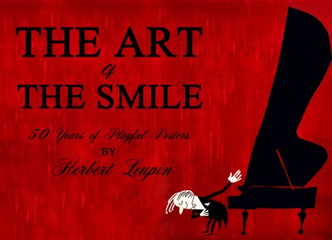
The Art of the Smile
September 27 - November 15, 2002
Join us as we celebrate the work of Herbert Leupin (1916-1999) with The Art of the Smile, the first one-man show presented by the gallery. Leupin created more than 500 posters, 89 of which received awards in the prestigious Swiss Poster of the Year competitions.
As a leading exponent of the Sachplakat or "Object Poster" style of the 1940s, Leupin created a style of poster art that was both extremely direct and sensuously beautiful. His hyperrealistic posters, so technically precise and sophisticated, turned everyday objects into icons. Leupin's injection of marketing imagination and gentle humor propelled the style into the forefront of Swiss poster art in the Forties.
In the '50s, Leupin reinvented himself to create a more relaxed, cartoonish style that would usher in a new international advertising movement. Leupin continued to work through the next three decades in a variety of styles, showing a mastery of idioms as diverse as the International Typographic Style to Constructivism and Pop Art, always with a puckish sense of humor and refined taste.
Leupin's work revealed a rich, personal universe of characters, symbols, and anthropomorphized animals to attract and delight the child in all of us. His imagination was as fertile as his celebrated poster predecessor, Leonetto Cappiello, creating everything from stallions that smoke cigars, parrots that hawk grapefruit soda, monkeys, seals and clowns that promote the circus to friendly trees that greet skiers. Cappiello once wrote: "Surprise is the foundation of advertising; it is its necessary condition." Surely Leupin's work confirms this insight.
Over many years, we have assembled the largest collection of Herbert Leupin's posters in the world, including many rare works from before WWII.
View our collection of Herbert Leupin posters here

Revolution by Design
February 6 - April 6, 2002
Curated by Catherine Amidon, Director of Exhibitions in conjunction with International Poster Gallery, Boston Massachusetts
"The notion of art into life and the theoretical constructs behind the visual arts in the fledgling Soviet Union between 1914 and 1932 are still alive in visual culture. The multitude of influences of Soviet design in contemporary American culture speak to the level of interest Constructivism has generated."
Nationally-standardized McDonalds' interiors are the ultimate realization of Rodchenko's "Workers' Club;" revolving Hyatt restaurants a manifestation of Tatlin's Tower ("Model for the Monument to the Third International"); and computer graphics provide the means to finally realize Ouspensky's theory of the fourth dimension in art."
Click here to learn more about Soviet posters.
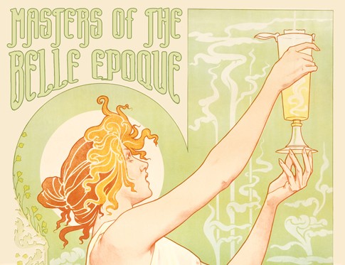
Poster Masters of the Belle Epoque 1890-1910
November 30, 2001 - January 20, 2002
Celebrate the season with our 8th Annual Holiday Show, Poster Masters of the Belle Epoque, featuring original Art Nouveau masterpieces large and small, 1890 to 1910.
The 1890s, known as the Belle Epoque, or "Beautiful Epoch", were the heyday of the poster. Several fine artists such as Pierre Bonnard, Edouard Vuillard, and Toulouse Lautrec were attracted to poster design. Lautrec's first poster, Moulin Rouge, created an instant sensation in 1891. In 1894, Alphonse Mucha, a Czech working in Paris, created the first masterpiece of Art Nouveau poster design. Bearing the influence of the Pre-Raphaelites, the Arts and Crafts Movement, and Byzantine art, this style was to dominate the Parisian scene for the next ten years and to become the major international decorative art movement up until World War I.
The 8th Annual Holiday Poster Show features such rare and outstanding Art Nouveau examples as Job (1898) and Moet Chandon (1899), by Mucha, as well as posters by Privat Livemont, who has been called the "Mucha" of Belgium. Privat Livemont's outstanding posters for Rajah (1889), Bitter Oriental (1897), and Absinthe Robette (1896), are included. A fine artist who only created a few posters, Pierre Bonnard, is represented by his striking poster for L'Estampe et l'Affiche (1897), an artistic and literary journal of the day.
Highlighted in the show is the complete "Maitres de L'Affiche", or "Masters of the Poster", 1895-1900, an original series of 256 of the greatest posters of the Belle Epoque, rendered in portfolio size. These smaller-scale lithographic treasures were published by Jules Cheret and include posters by 97 artists including Toulouse-Lautrec, Mucha, Bonnard, Livemont, Parrish, Bradley, and Hohenstein.
View more Belle Epoque posters here
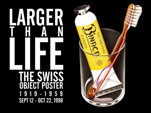
Larger Than Life
September 12 - October 22, 1998
Objects larger than life - so large they become icons - are the subject matter of Switzerland's leading poster style after World War I and continuing beyond mid-century. Featuring hyper-realistic drawings of everyday objects with little text, the style focused everything on the beauty and precision of even the most mundane products.
As a group, these posters reveal breathtaking graphic skill and unprecedented printing quality, and are in many ways the culmination of the classic age of the lithographic poster. We have assembled a spectacular assortment of these images - more than 50 from the best Swiss artists, such as Baumburger, Stoecklin, Birkhauser, Leupin and Brun.
The term "Sachplakat," or Object Poster, was coined in Germany to describe a new type of poster that featured a realistic depiction of the product and little else, consisting of only the product and its brand name in a flat and simple style. Lucian Bernhard's revolutionary 1905 poster for Preister matches is considered the first of this type, and its flat colors and simplified shapes became the hallmark for a new graphic style called the "Poster Style."
It wasn't until around 1908 that Switzerland awoke to the commercial opportunities of modern graphic design. The Swiss looked first to its more advanced neighbors to create a modern style. This accelerated as many young Swiss artists returned home from studies abroad before World War I, bringing the new ideas home with them.
When the first Swiss Object Posters appeared around 1910 they showed a strong resemblance to the German model. In 1919, however, a new type appeared in Zurich - a marvelous top hat by Baumberger for Baumann - that was so realistic viewers thought it must be a photograph. His 1923 PKZ coat, with no text save the coat's label, was so illusionistic that it stopped viewers in their tracks. Baumberger and other Zurich artists continued to make Object Posters in the Twenties and beyond, and were joined by several superb artists in Basel. They were led by Niklaus Stoecklin, a young surrealist painter who returned Munich in 1914, where he had absorbed the lessons of the modern poster style from Hohlwein.
Stoecklin's early masterpiece for a bookmaking exhibition at the Basel Design Museum in 1922 reveals his Purist approach. Stoecklin's Object Posters became more super realistic after 1923, perhaps in response to Baumberger's PKZ coat. In 1934, Stoecklin's pupil Peter Birkhauser began to create impeccable posters in the super-realist style. His poster of a button for PKZ in 1934 took the Object Poster perhaps to its ultimate distillation -- now the image is a symbol of an idea, rather than a full visualization of the product.
Another newcomer named Herbert Leupin appeared in Basel in 1937 who would have a major impact on the style. Leupin, created about 500 posters over a 30 year span, with an unprecedented 89 of them winning Swiss Poster of the Year awards. His most famous poster for Eptinger mineral water (a series which spanned more than three decades) simply showed a damaged traffic sign with the words "Drink Eptinger instead!"
To this day the Swiss Object Poster remains unsurpassed in its sheer sensuous beauty and technical precision. The style would remain popular in Switzerland into the Forties and Fifties, especially in Basel, and continued to evolve through dynamic composition variations and the addition of humor. This final flowering was in many ways an appropriate finale to the lithographic poster technique, which was so important to the development of modern advertising and graphic design.
View all Object posters here

War and Revolution
February 20 - March 31, 1997
"War and Revolution" will compare and contrast the propaganda posters of the United States in World War I (1914-1918) with that of the Bolsheviks during the Russian Revolution and Civil War period (1918-1921). The show is assembled from the gallery's rich holdings which have been recently augmented by the purchase of two major collections.
American Posters during World War I
The WWI poster was most successful in the United States. In less than two years more than 2,500 designs and about 20 million posters were produced to convince America to abandon its isolationist policy and conduct a full scale war against Germany. The organization responsible for most of this was the Department of Pictorial Publicity, an all-volunteer group of 300 artists led by Charles Dana Gibson, the creator of the Gibson girl and the most highly paid artist in America. Through its posters, the DPP was instrumental in raising money (more than any other combatant in the war), building ships, recruiting troops, saving food and fuel, and marshaling relief efforts which helped to win the war.
Soviet Posters during the Bolshevik Revolution
At virtually the same time, Lenin was using the poster to conduct a very different kind of war. While WWI was primarily a distant war fought primarily in the factory and with the pocketbook in America, the Bolshevik Revolution was a bloody struggle for survival of an ideology and a faction. The exhibit will highlight the various Soviet agencies which directed Lenin's propaganda efforts during the Civil War, in all producing over 3000 poster designs in four years. Its most important artists were Alexander Apsit, Dimitri Moor, Viktor Deni and Nikolai Kochergin, who created many popular slogans, icons and satirical caricatures of the revolution - often in less than a day.
Russian Telegraph Agency (ROSTA) Windows
The show will also include another Soviet innovation, the so-called Russian Telegraph Agency (ROSTA) windows. These were cartoon-like stenciled posters which summarized the news and were displayed in shop windows throughout Moscow during the Civil War years. These works by the great poet Vladimir Mayakovsky, Ivan Malyutin and Mikhail Cheremnykh are extraordinary in their rarity, wit and effectiveness.
Despite many similarities, the posters from the two struggles show major differences. The American poster is remarkable for its heroic innocence and its Madison Avenue appeal; the Soviet poster for its biting sarcasm and raw immediacy. The air of moral superiority seen in the American posters is more than matched by the revolutionary idealism of the Bolsheviks, who attack priests and capitalists while idealizing the worker.
"This is a powerful juxtaposition of the propaganda of the two major powers of the twentieth century," states Jim Lapides, gallery owner. "Both styles were so successful that they became the models for what was to follow in later conflicts of the century. We are fortunate that these historically important and graphically powerful images are still available and very affordable." Many posters in the show are less than $1000. "These images represent as good a value as can be found in the poster field today."
View all War and Propaganda posters